Food Bank of Mira Mesa Food Bank of Mira Mesa Food Bank of Mira Mesa Food Bank of Mira Mesa Food Bank of Mira Mesa Food Bank of Mira Mesa Food Bank of Mira Mesa Food Bank of Mira Mesa Food Bank of Mira Mesa Food Bank of Mira Mesa Food Bank of Mira Mesa Food Bank of Mira Mesa
Design isn’t just about making things look good—it’s about amplifying impact. With the Food Bank of Mira Mesa project, we crafted visuals and materials that not only told their story but mobilized the community to take action, bridging design with purpose.
- Nikita BaBichev, Creative Director
Overview
SCALING A
HIGH-Impact Organization
IN Mira Mesa
SERVICES:
BRAND POSITIONING
BRAND IDENTITY
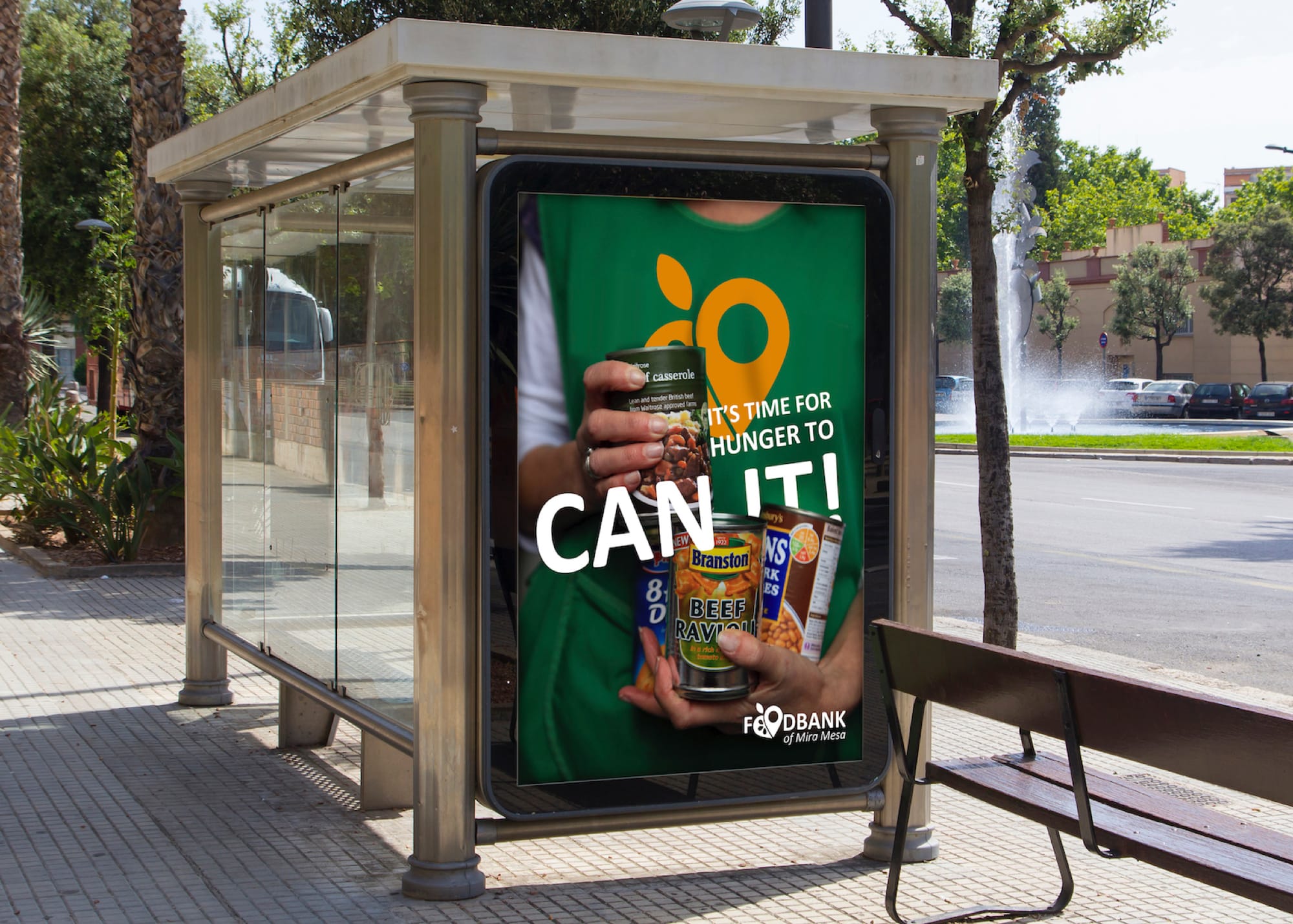
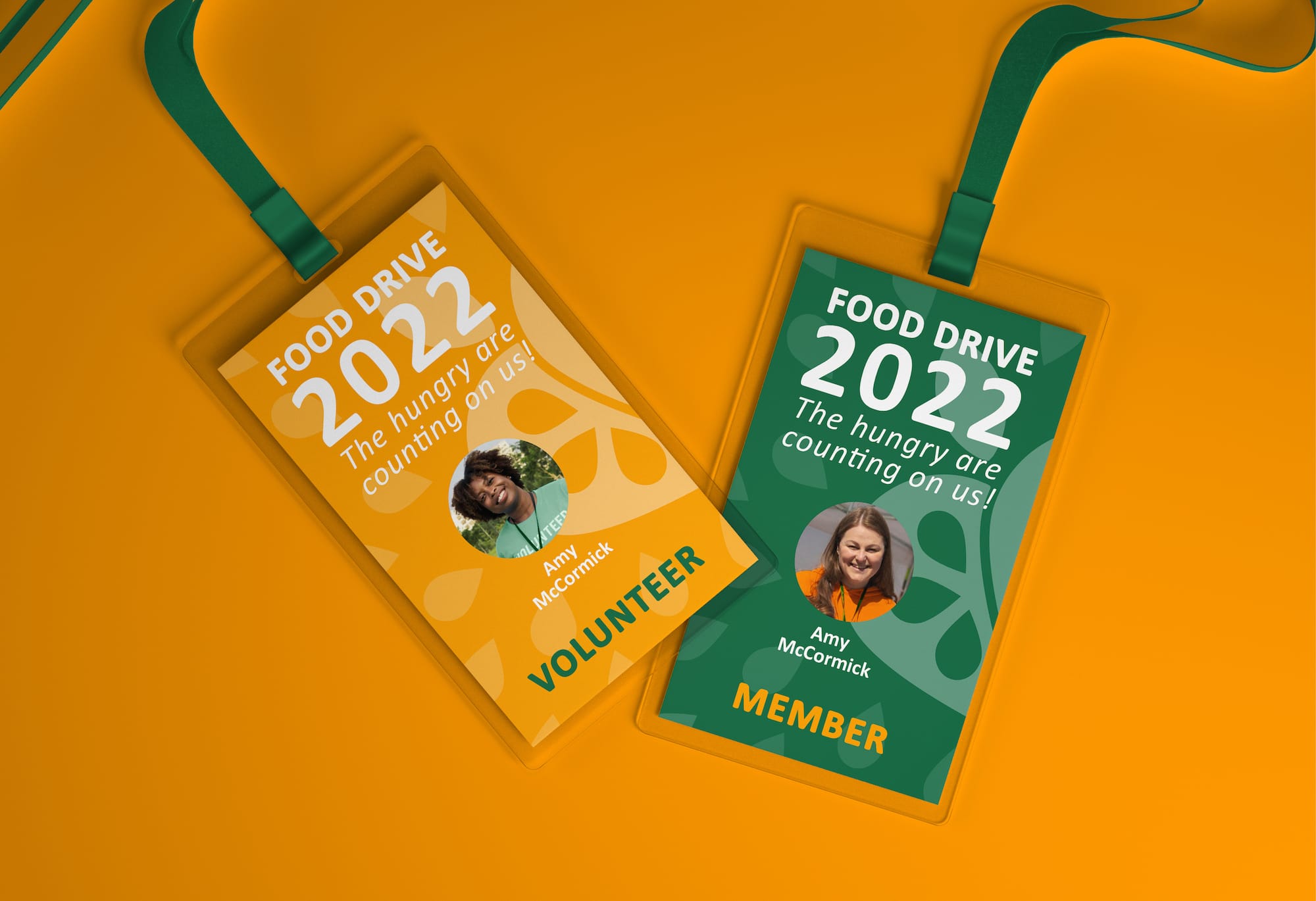
Signage and Print
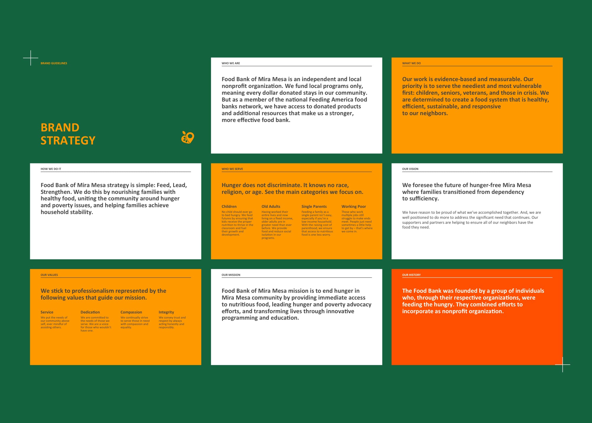
Food Bank of Mira Mesa is an independent and local nonprofit organization. It funds local programs only, meaning every dollar donated stays in our community. As a member of the national Feeding America food banks network, it has an access to donated products and additional resources that make it a stronger, more effective food bank. The food bank that demands the matching strong brand.
Challenge
A POSITIONING WITH HEART AND SOUL
The organization derived from San Diego Food Bank and it required the start the brand from the scratch. We conducted a study to understand where we can leverage the community impact. The main goal was to create a strong brand strategy. We expanded the visual language of the organization, introducing a modern typeface, bold colors, and authentic photo photography, which together helped the brand extend flexibly.
#FightHunger#FightHunger#FightHunger#FightHunger#FightHunger#FightHunger#FightHunger#FightHunger#FightHunger#FightHunger#FightHunger#FightHunger#FightHunger#FightHunger#FightHunger#FightHunger#FightHunger#FightHunger
Approach
BALANCED DESIGN. APPROACHABLE TONE
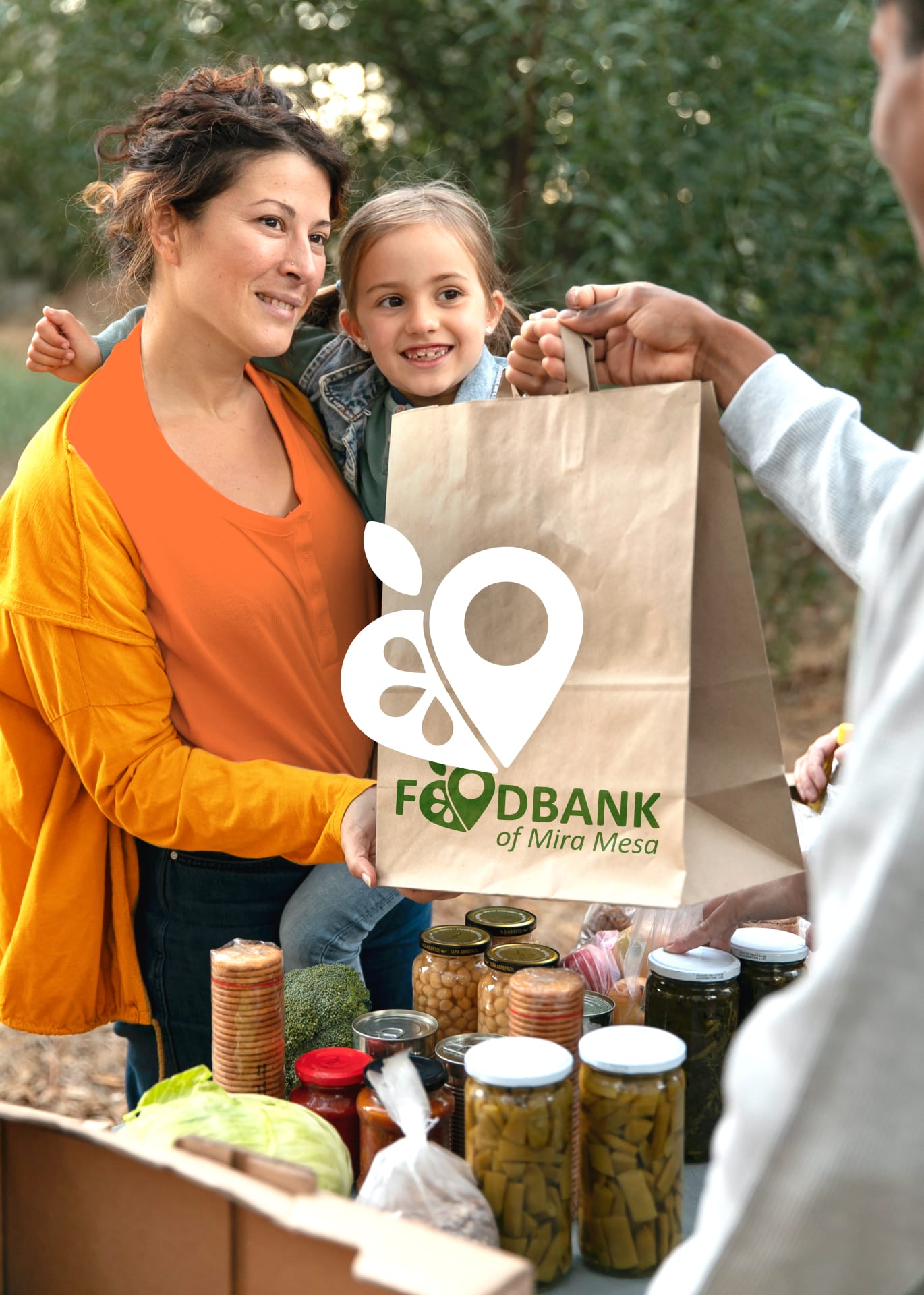
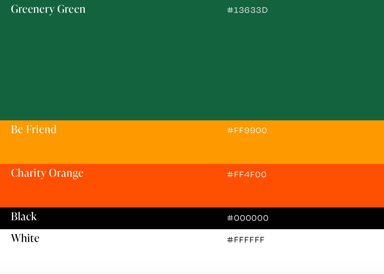
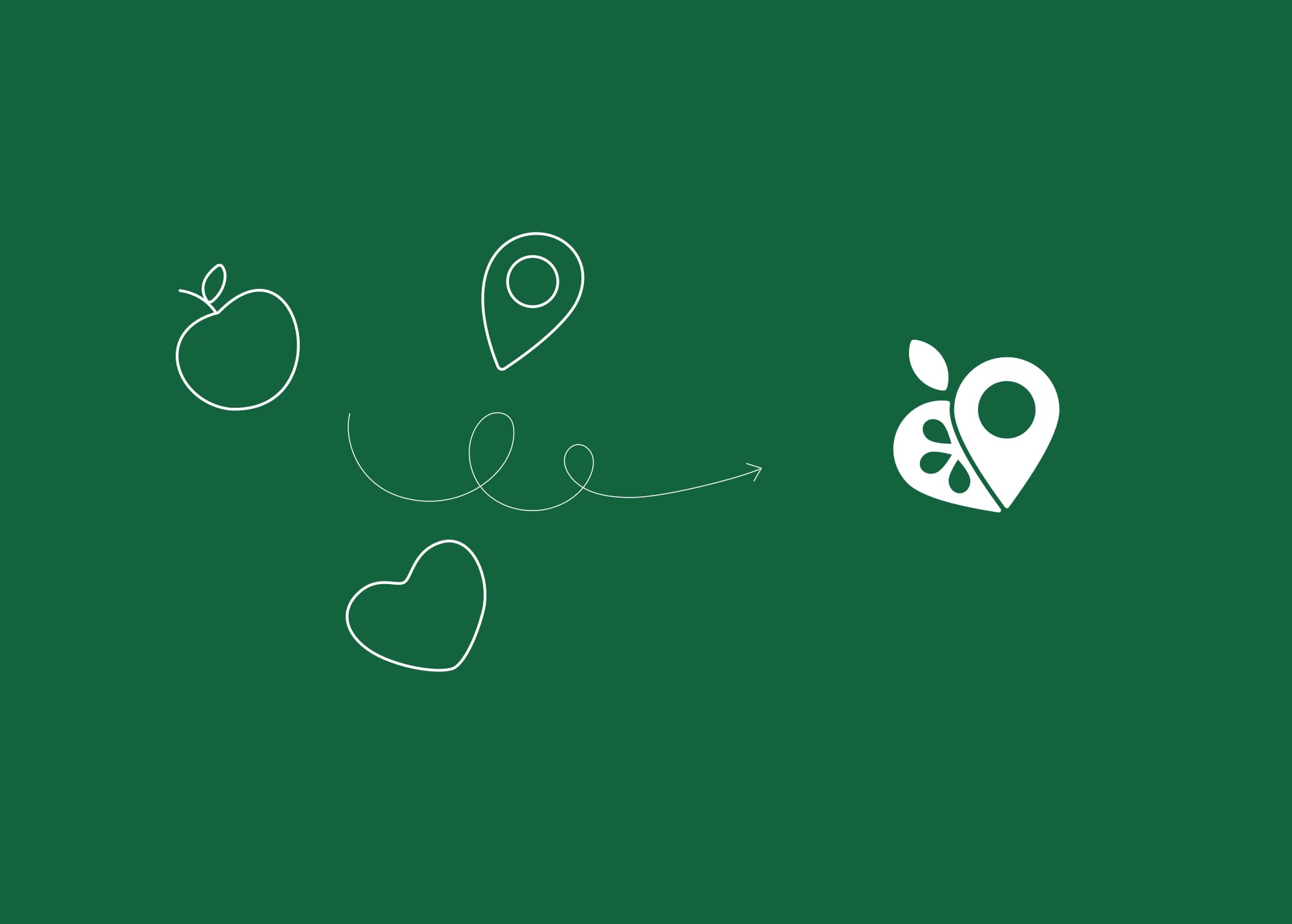
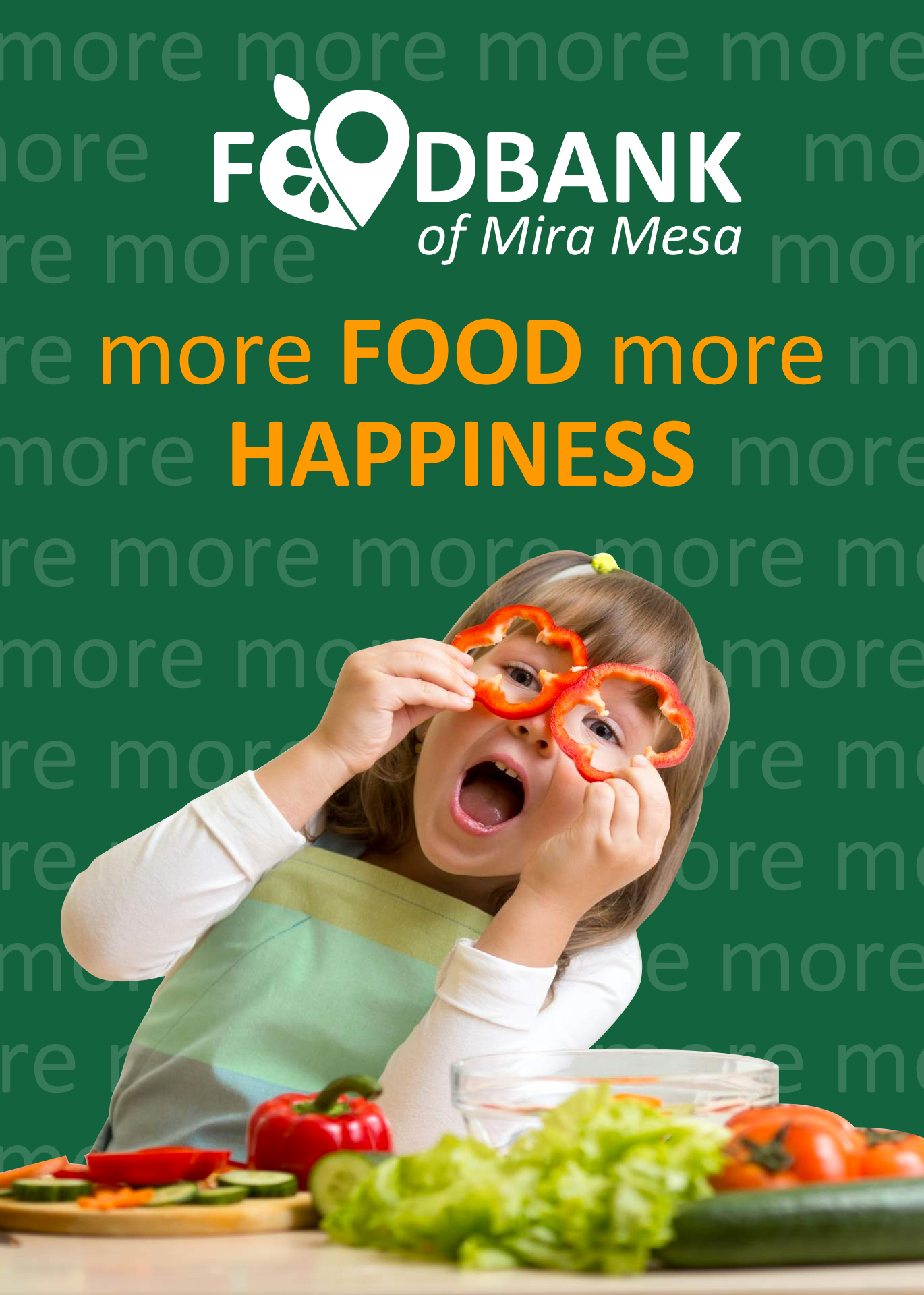
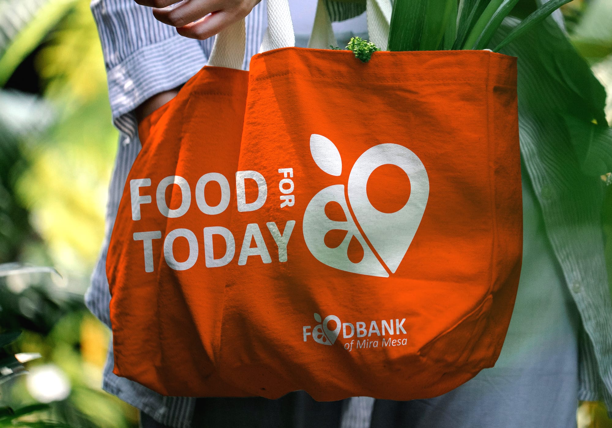
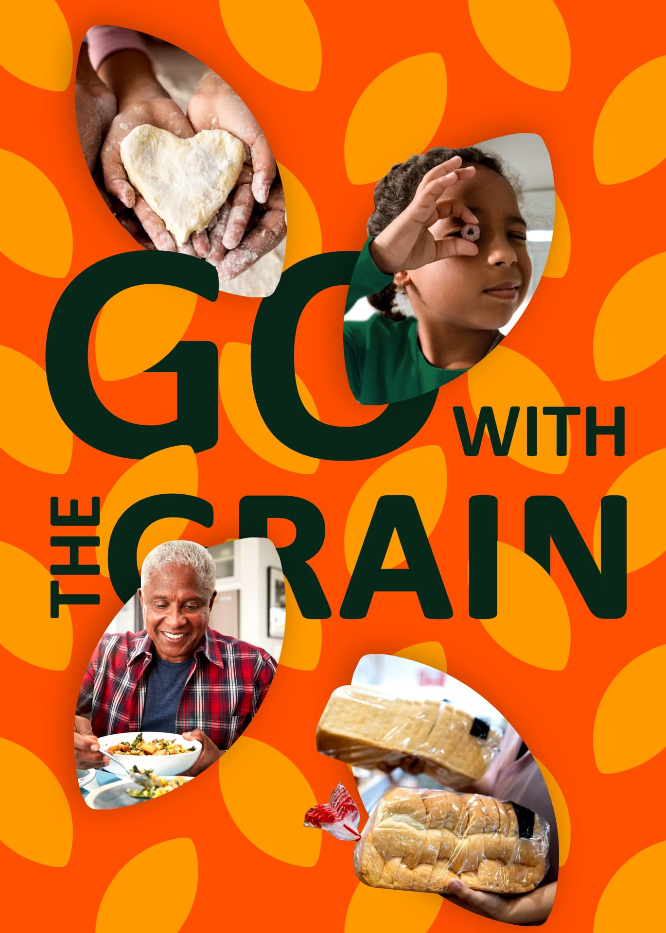
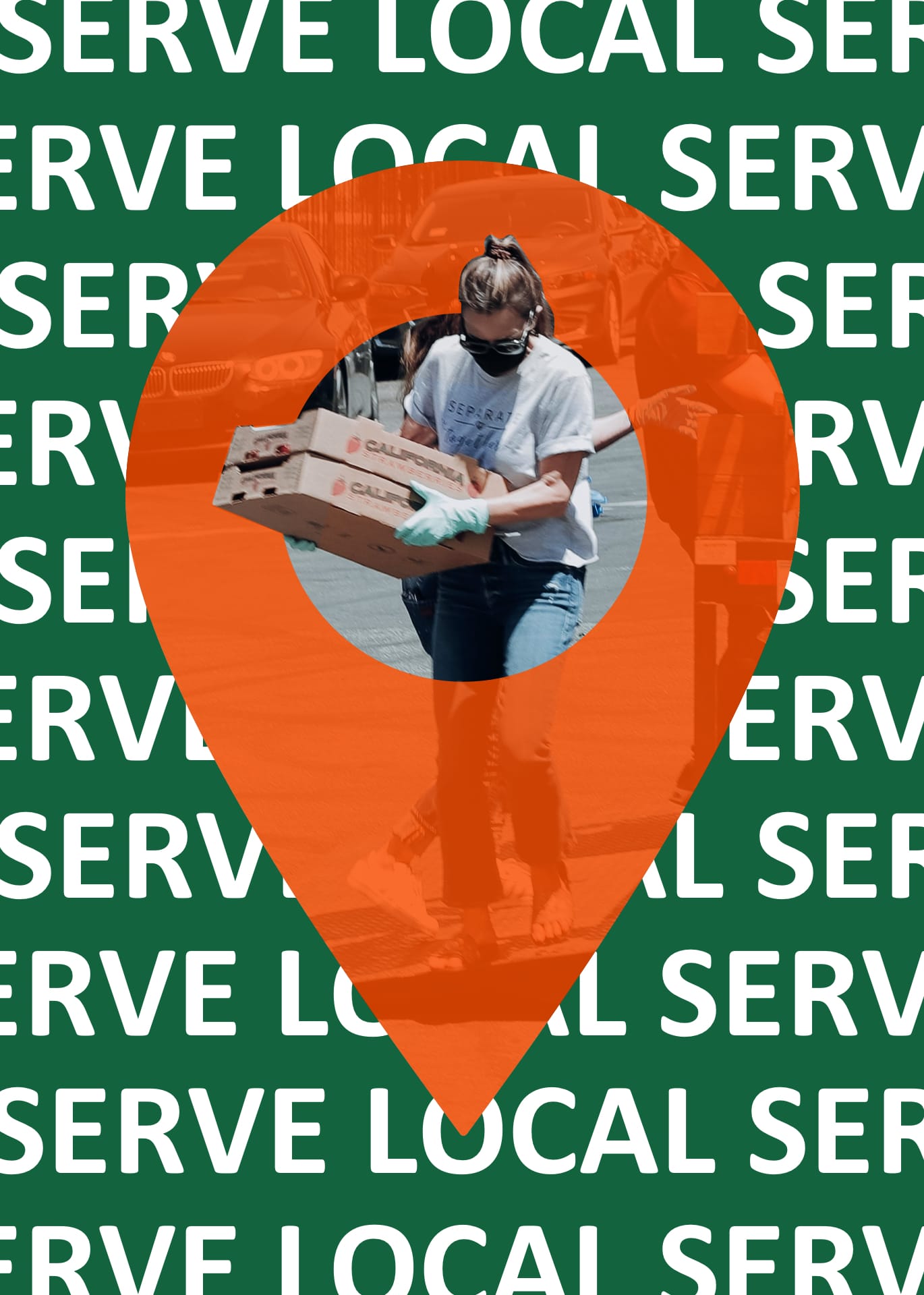
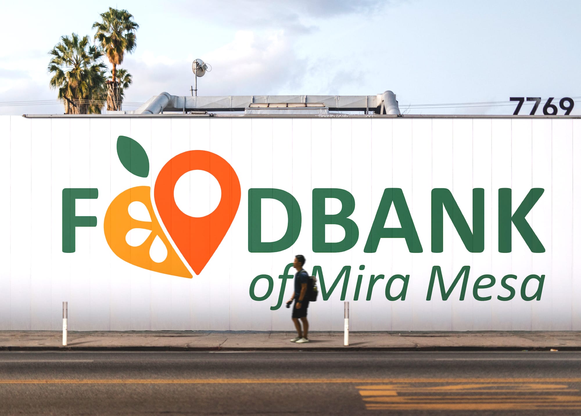
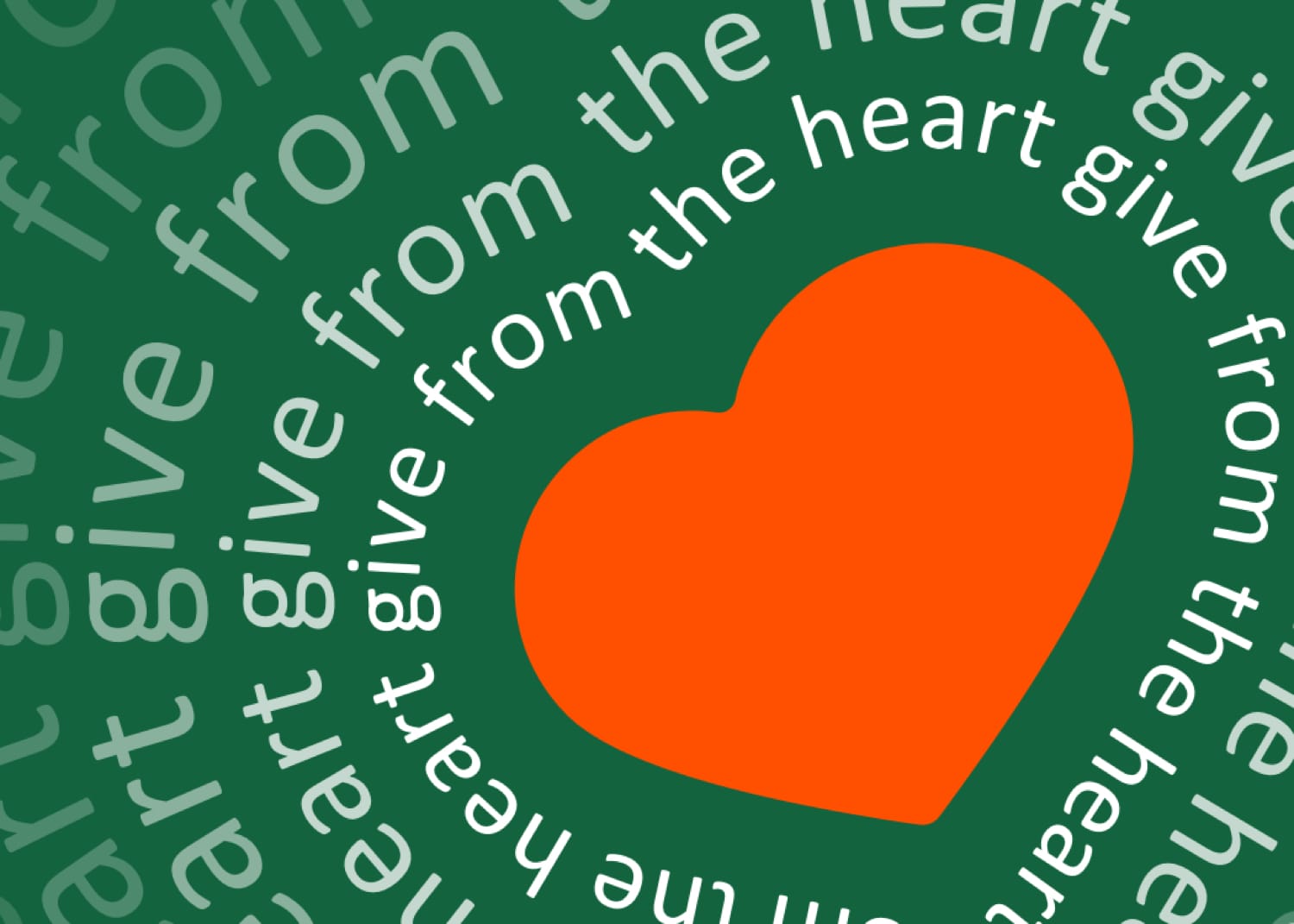
To bring the brand to life, we reimagined the brand identity from the ground up. We began by creating a fluid combination of vigorous sign and wordmark—the central elements of the logo are fruit and location that work as replacements to double “O” and form a heart shape at the same time. With two interplaying circles, it was a subtle visual nod to the idea of balance. The typeface has geometric shapes with soft corners to match the soft sign edges of the wordmark. We built out the art direction aiming to meet the neighborhood’s expectations. Color palettes in energetic tones connect the brand to the vibrant San Diego community. Imagery highlighted an emotional experience, while the brand tone remains approachable, friendly, and elevated.
Whoever might be in need – a family facing financial crisis due to an economic downturn, an older adult having a hard time making ends meet on a fixed income, a veteran experiencing challenges after years of brave service, or a child without access to free or reduced-cost meals because school is not in session – our top priority is to feed the hungry. But our dream is to end the scourge of hunger, forever – we hope you will join us in the fight!
– Michael Reynolds, Community Programs Manager
Impact
Fight for what makes a difference
+36%
Volunteers growth
+4,5M
Pounds of food distributed
+22
New food donors
