C.H.Robinson C.H.Robinson C.H.RobinsonC.H.Robinson C.H.Robinson C.H.Robinson C.H.Robinson C.H.Robinson C.H.Robinson C.H.Robinson C.H.Robinson C.H.Robinson C.H.Robinson C.H.Robinson C.H.Robinson C.H.Robinson C.H.Robinson C.H.Robinson C.H.Robinson C.H.Robinson C.H.Robinson C.H.Robinson C.H.Robinson C.H.Robinson C.H.Robinson C.H.Robinson C.H.Robinson C.H.Robinson C.H.Robinson
This project challenged me to translate high-density logistics data into intuitive, actionable design. Every screen we rethought wasn’t just about visual polish—it was about giving freight teams control, speed, and clarity in the moments they need it most.
- Nikita BaBichev, Creative Director
Overview
Simplifying Freight UX
Role:
Journey Mapping
Usability audits on Legacy Interface
Design System Development
Design Documentation
Stakeholder Interviews
Web Design and Development
We set out to reimagine the digital experience at the core of global logistics, partnering with C.H. Robinson to evolve their Navisphere platform into a more intuitive, responsive, and insight-driven tool. Rooted in real-world logistics complexity, our approach centered on the needs of operators, freight managers, and 3PL partners. We engaged deeply with stakeholders across disciplines—from warehouse teams to enterprise supply chain leads—to understand their pain points and daily decisions. Through strategic UX and UI enhancements, we brought clarity to complex shipment data, streamlined workflows, and designed mobile experiences that empowered users at every touchpoint. This collaborative transformation didn’t just enhance the product—it strengthened trust, efficiency, and decision-making across the global freight ecosystem.
Challenge
Unifying the Freight Experience
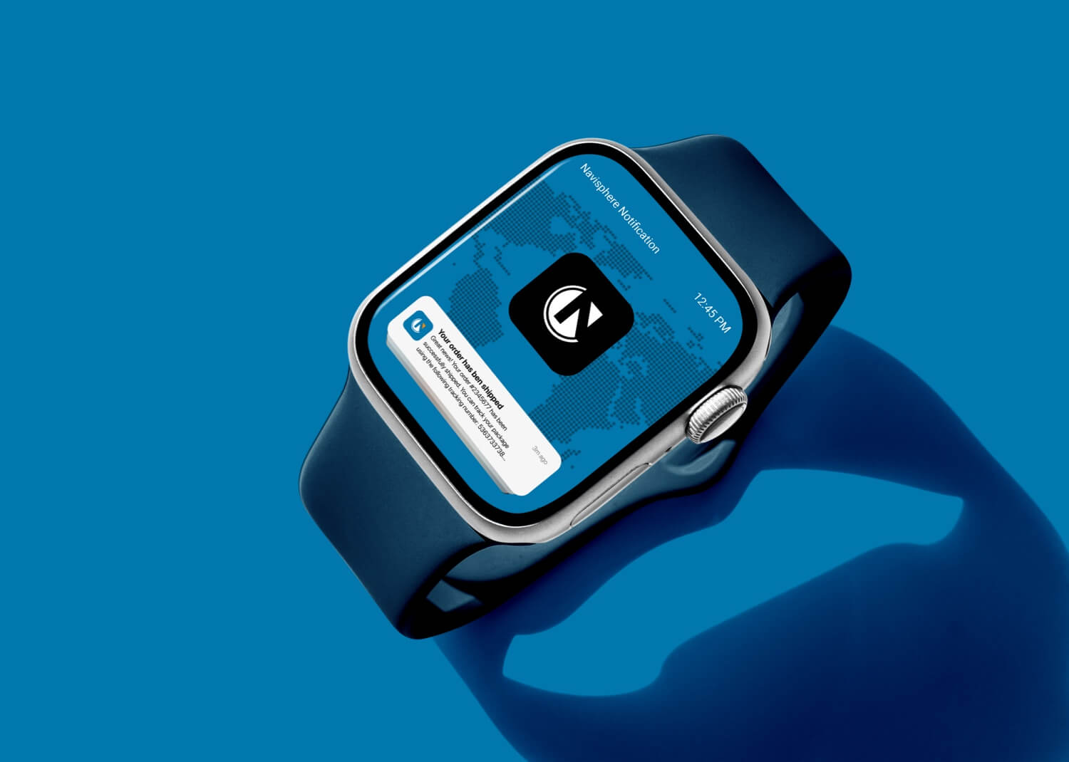
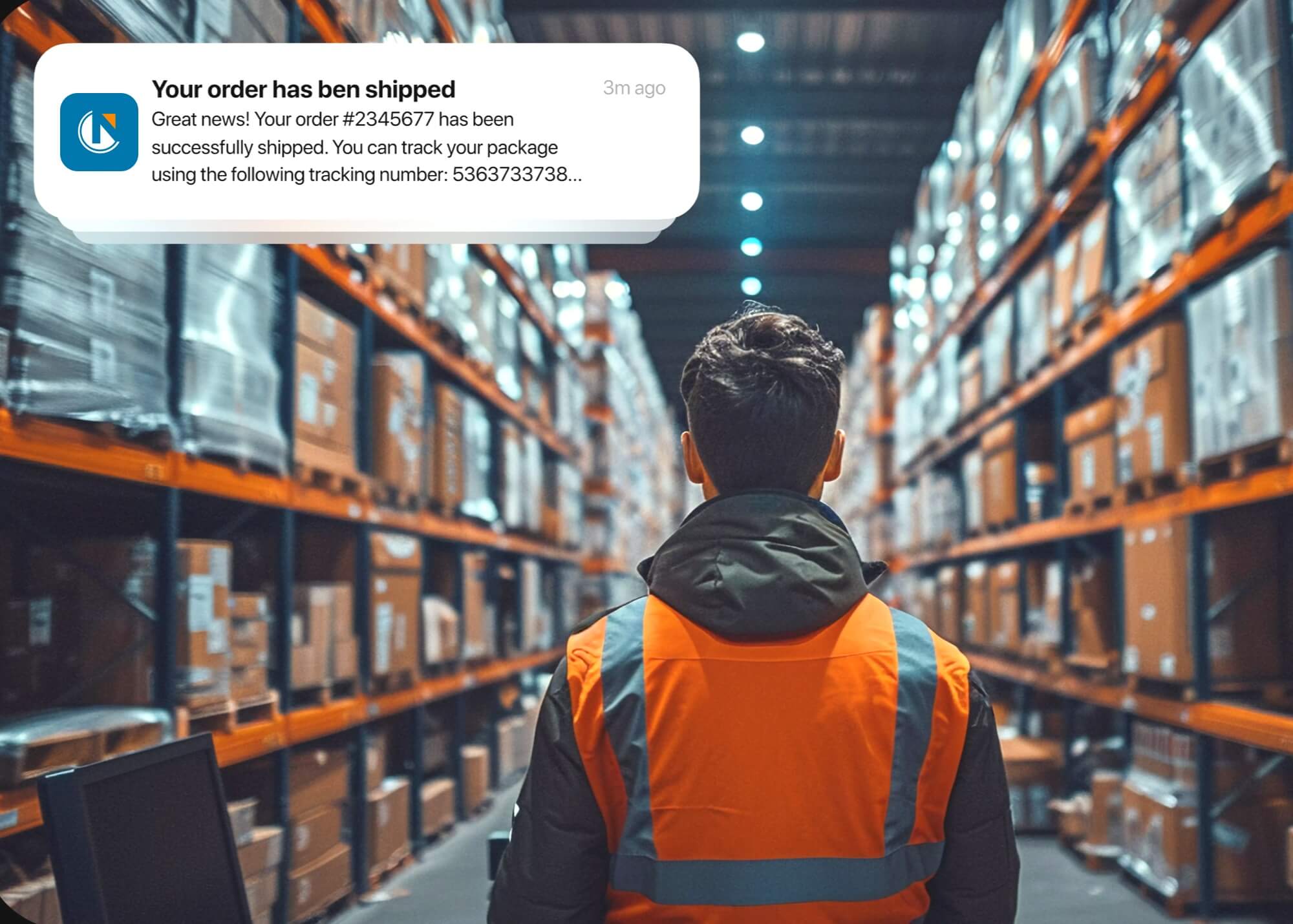
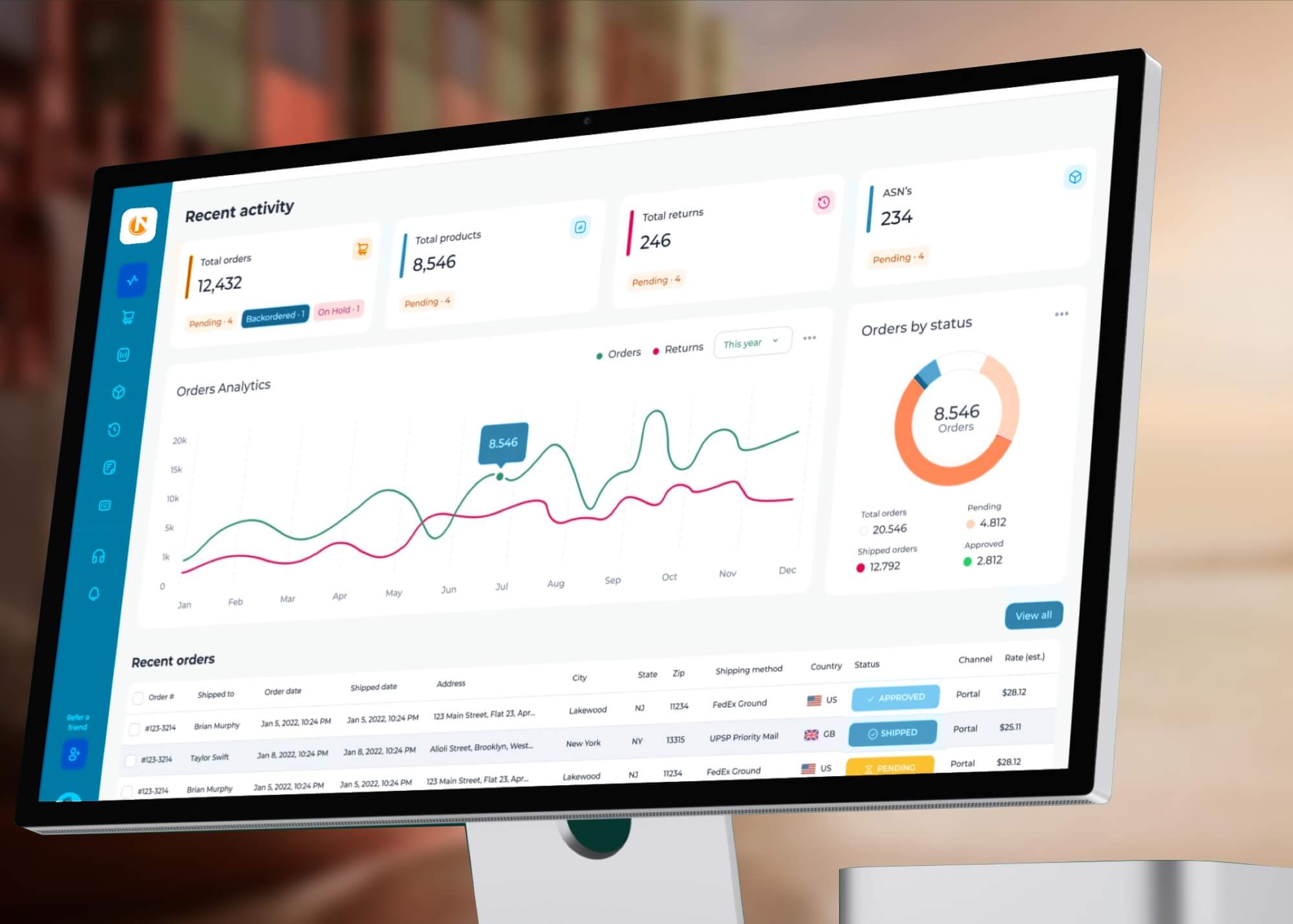
Legacy tools within the Navisphere platform made it difficult for logistics professionals to access timely shipment insights, manage multimodal freight, and maintain performance under pressure. Many users faced siloed data, non-intuitive dashboards, and a lack of mobile adaptability—all of which slowed decisions and increased the risk of missed deliveries, chargebacks, and SLA violations. Our design challenge was to transform Navisphere into a centralized, real-time logistics command center. By improving visual clarity, simplifying navigation, and supporting mobile-first workflows, the redesign empowered supply chain teams to stay proactive and precise—no matter the complexity of their freight network.
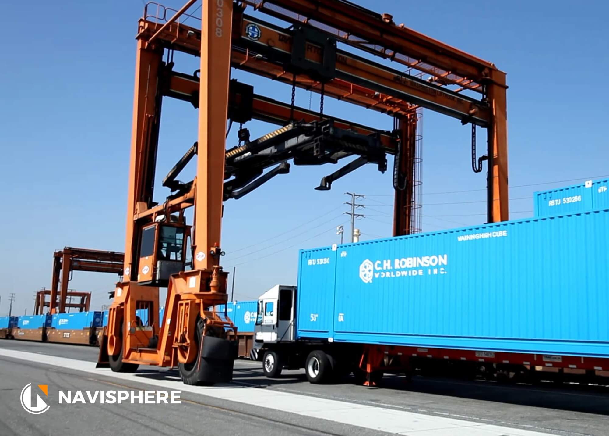
#Navisphere#Navisphere#Navisphere#Navisphere#Navisphere#Navisphere#Navisphere#Navisphere#Navisphere#Navisphere#Navisphere#Navisphere#Navisphere#Navisphere#Navisphere#Navisphere#Navisphere#Navisphere#Navisphere#Navisphere#Navisphere#Navisphere#Navisphere#Navisphere
Approach
Clarity in Motion
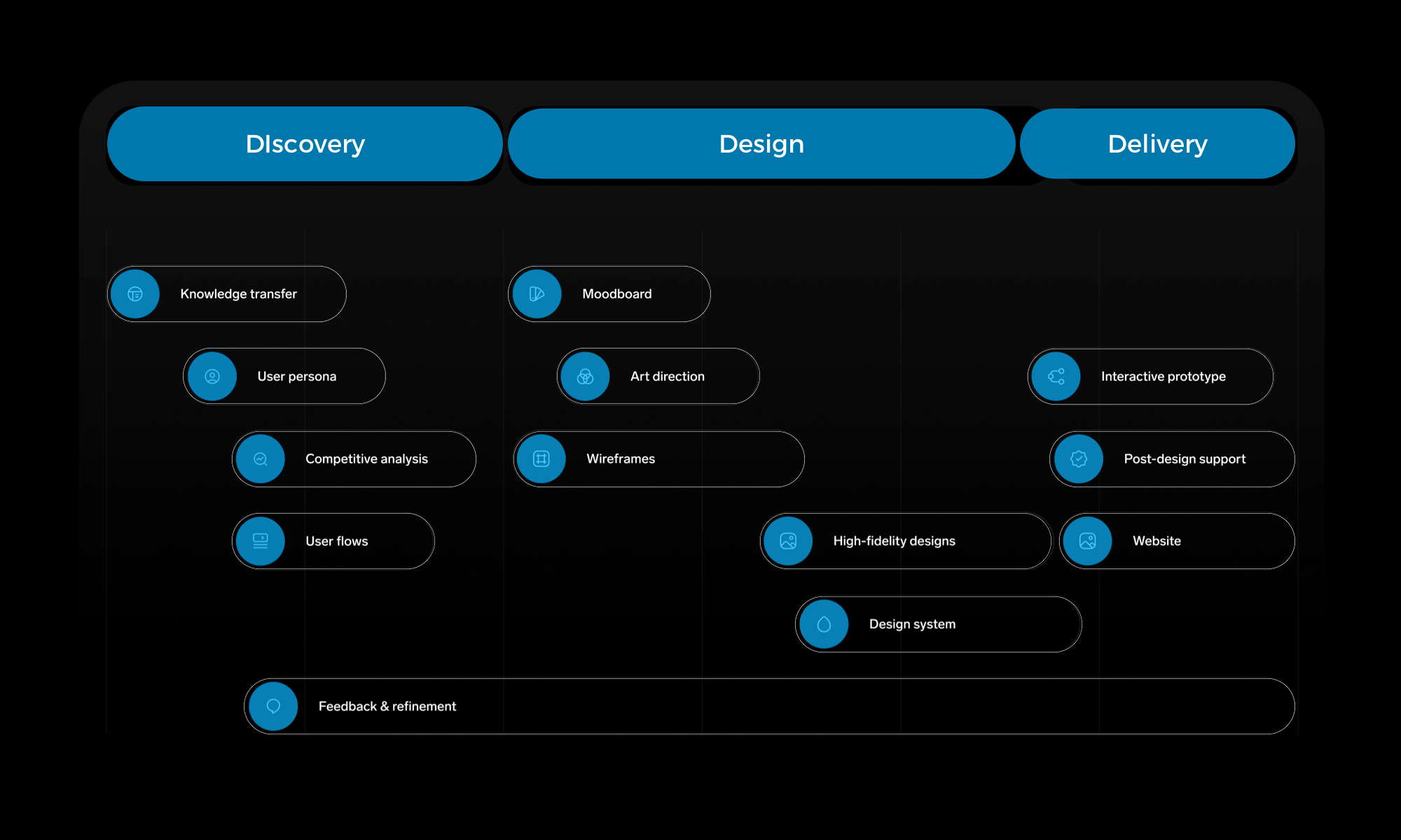
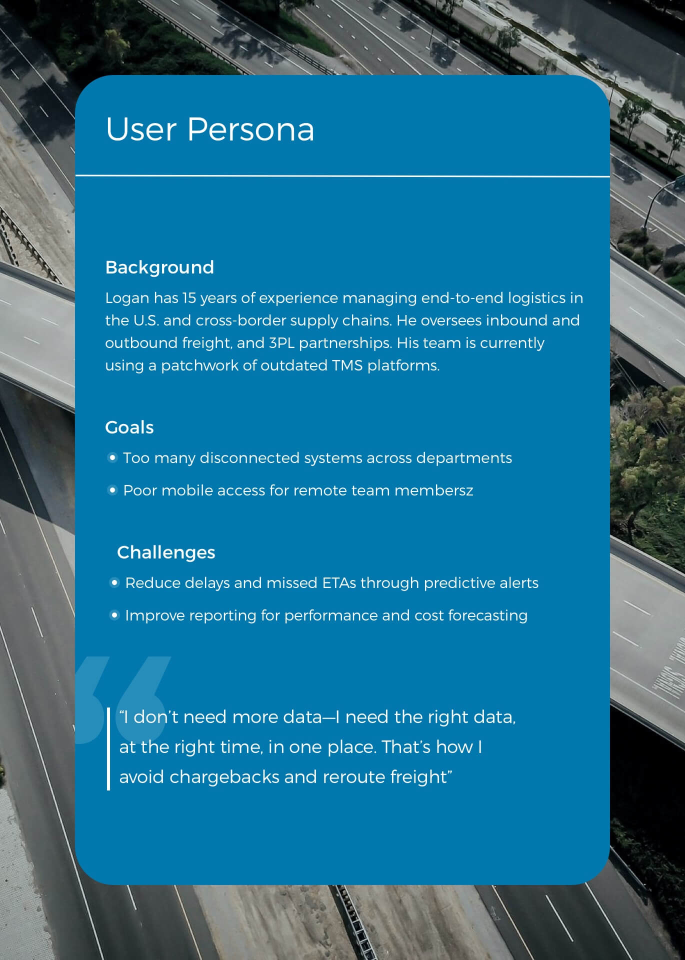
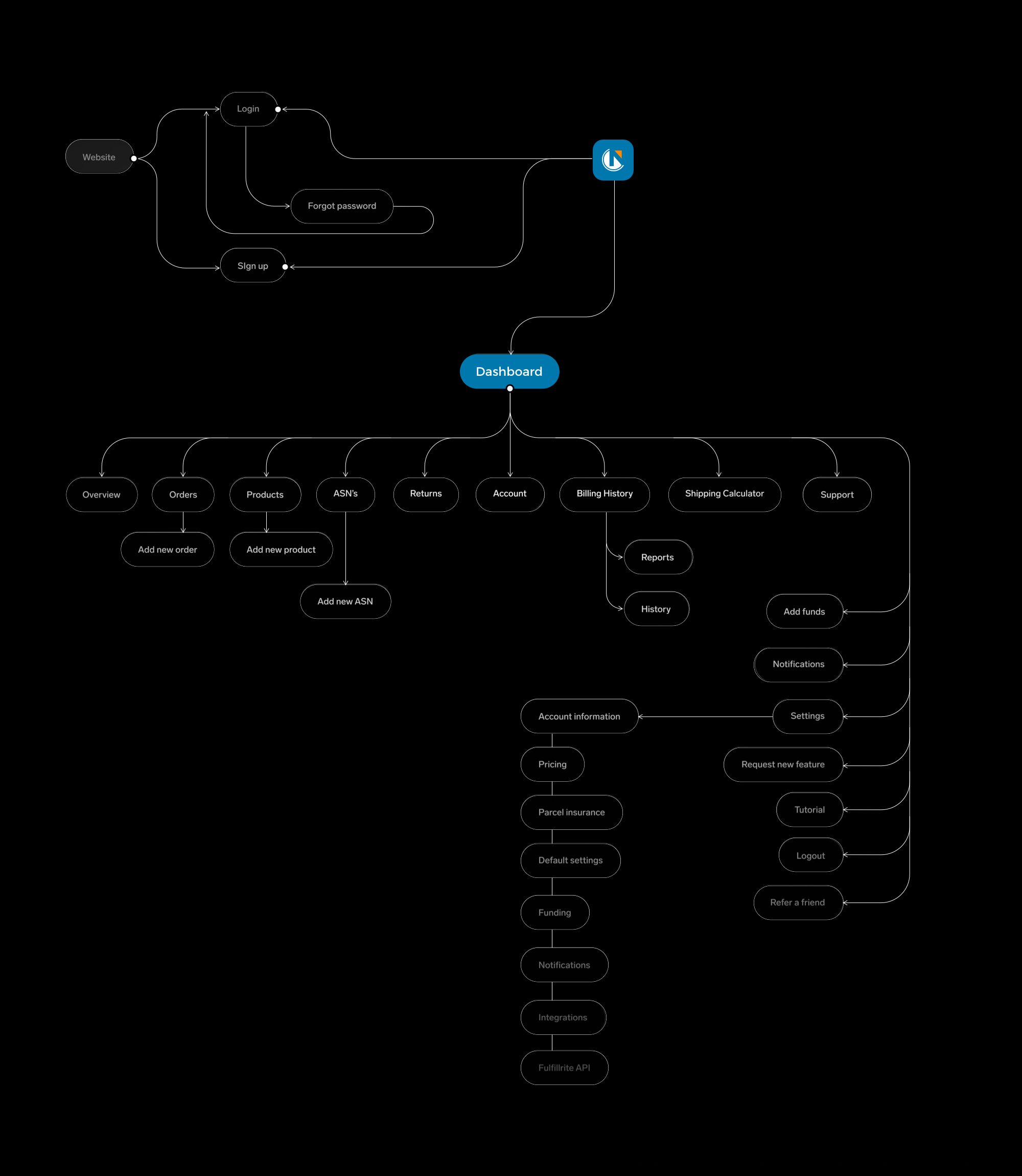
We started with interviews and observation sessions to understand the daily workflows of logistics managers, planners, and carriers. From there, we mapped common user journeys and prioritized the most time-sensitive tasks—such as shipment tracking, load status updates, and exception handling. We created low-fidelity wireframes to test layout clarity, then iterated with high-fidelity prototypes built for real-world density and mobile responsiveness. Throughout, we collaborated with C.H. Robinson product teams to align the UX vision with the platform’s technical capabilities and roadmap.

User Enablement
A New First Touch
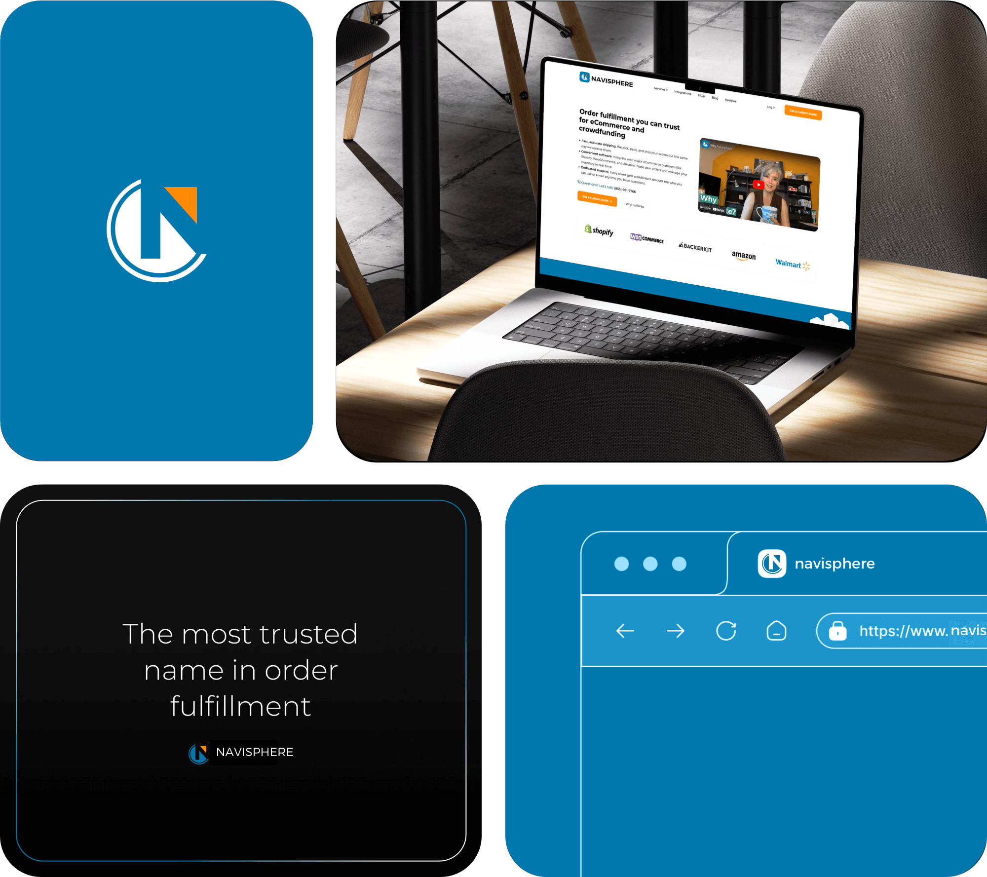
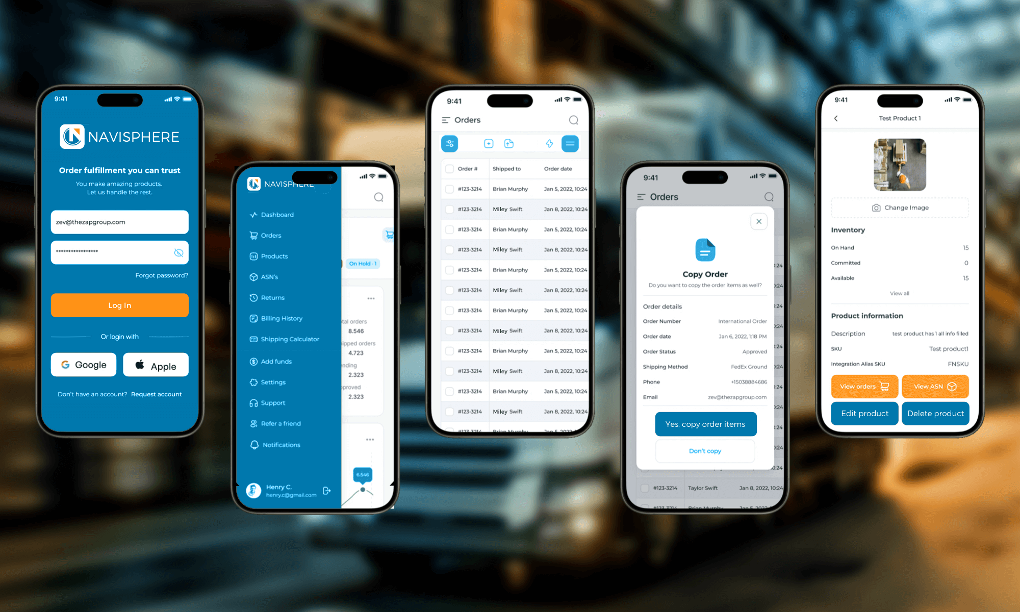
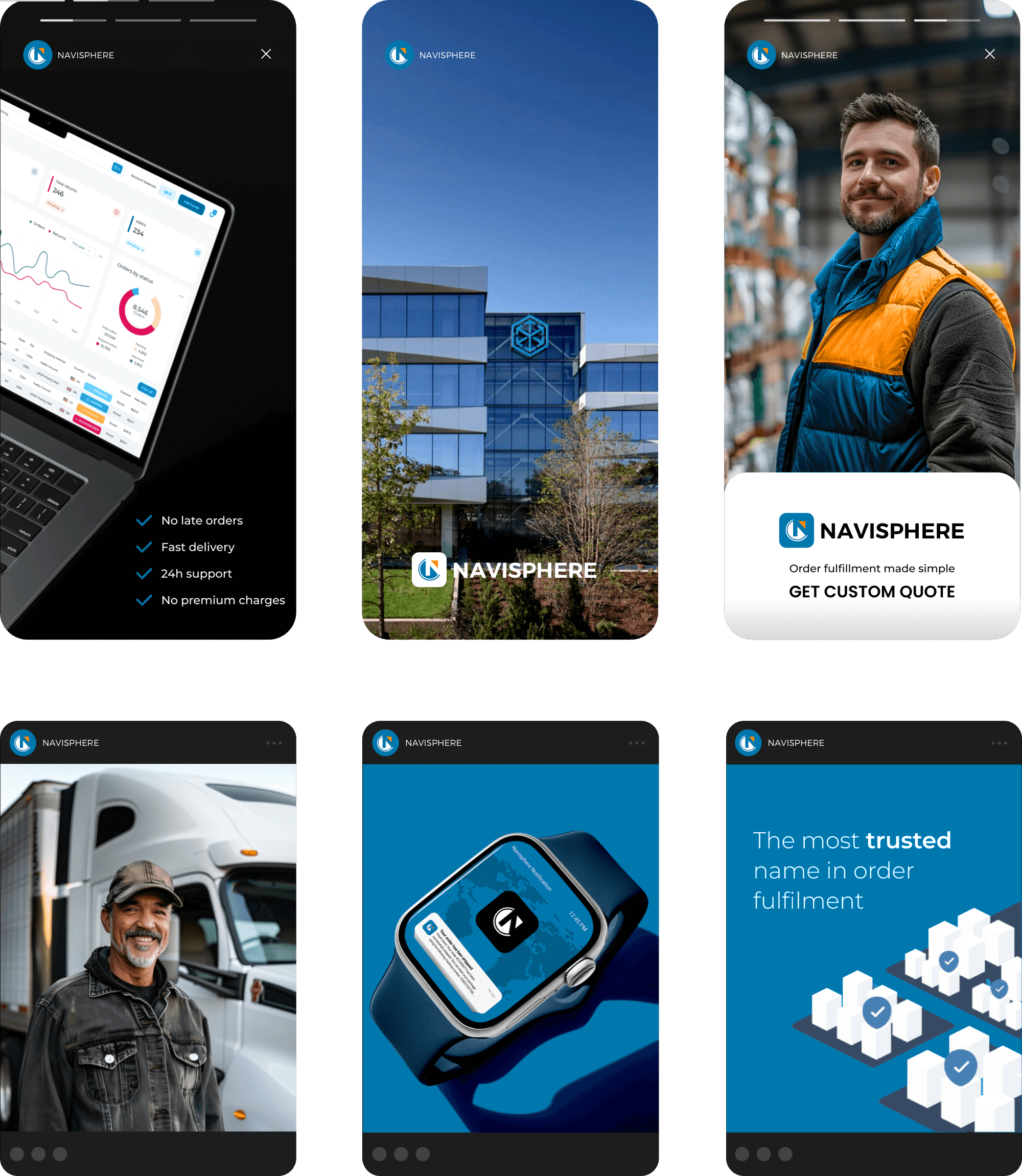
To support the platform launch, we designed a dedicated landing page that introduced users to Navisphere’s updated experience. The page distilled key benefits—real-time visibility, mobile access, and streamlined workflows—into a compelling narrative backed by visuals and UI highlights. It acted as both a marketing asset and onboarding tool, helping internal teams and clients quickly understand what had changed and how to get the most from the platform. Clear CTAs and embedded support links made it easy to move from awareness to action.


Design System
Consistency at Scale
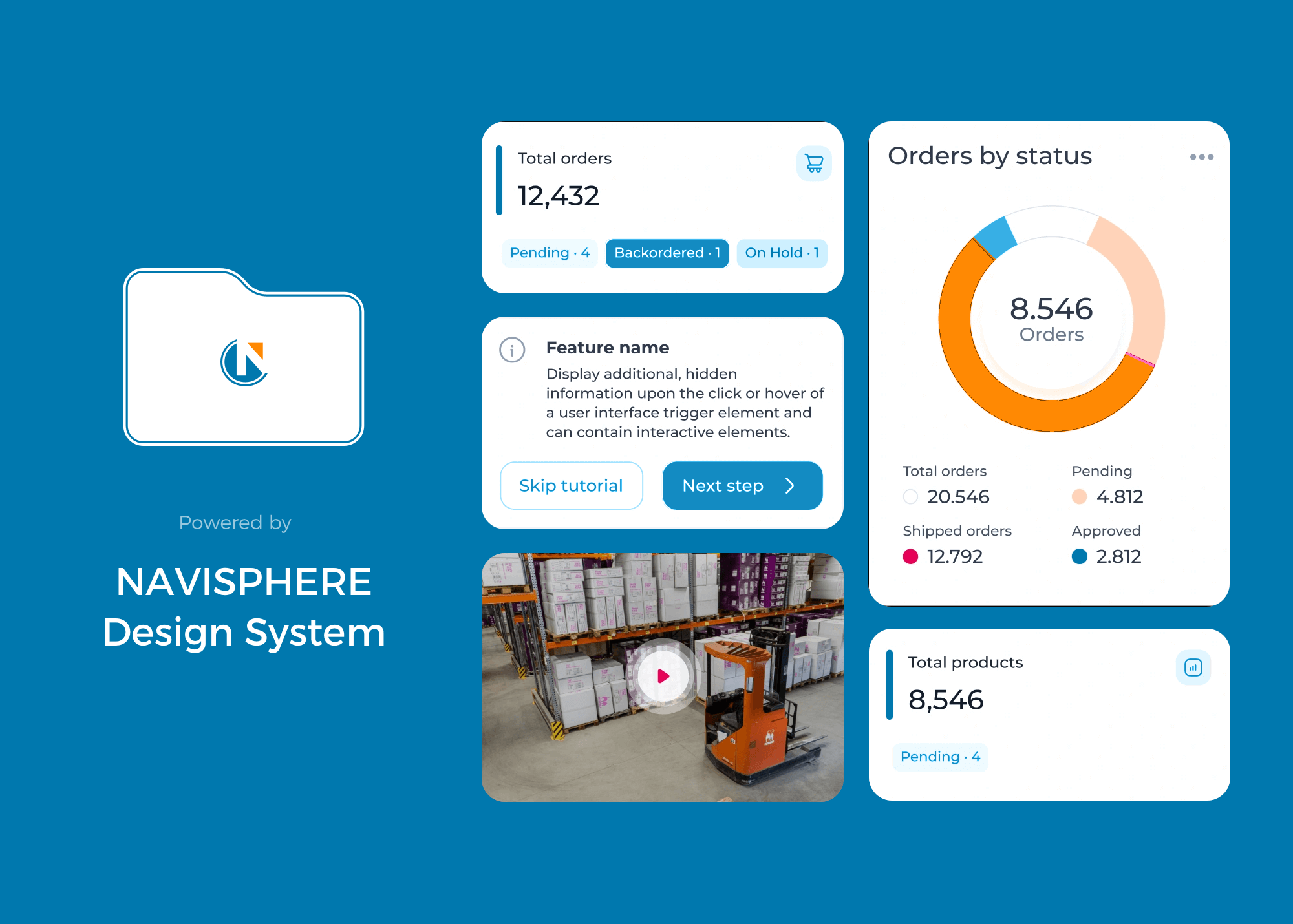
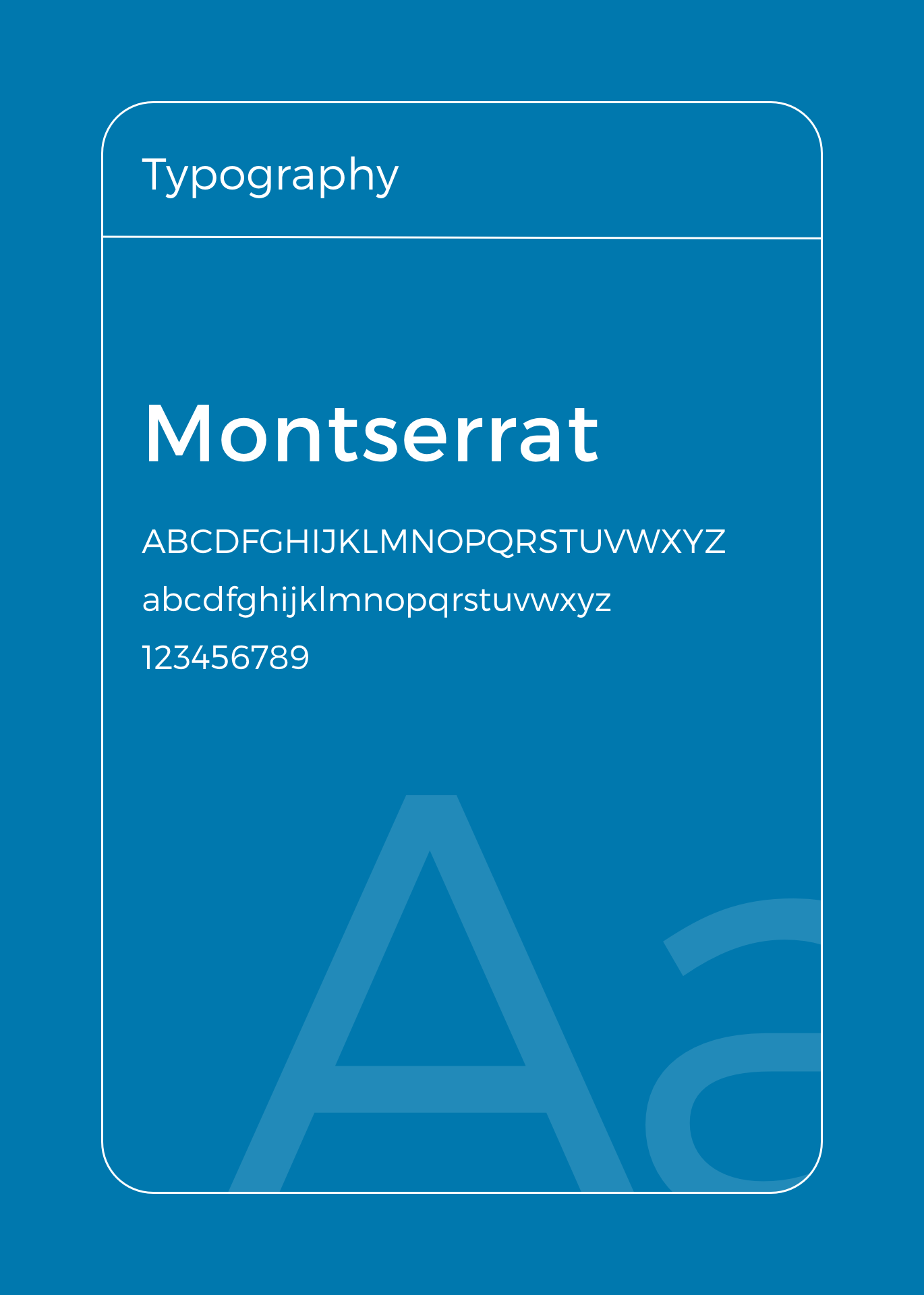
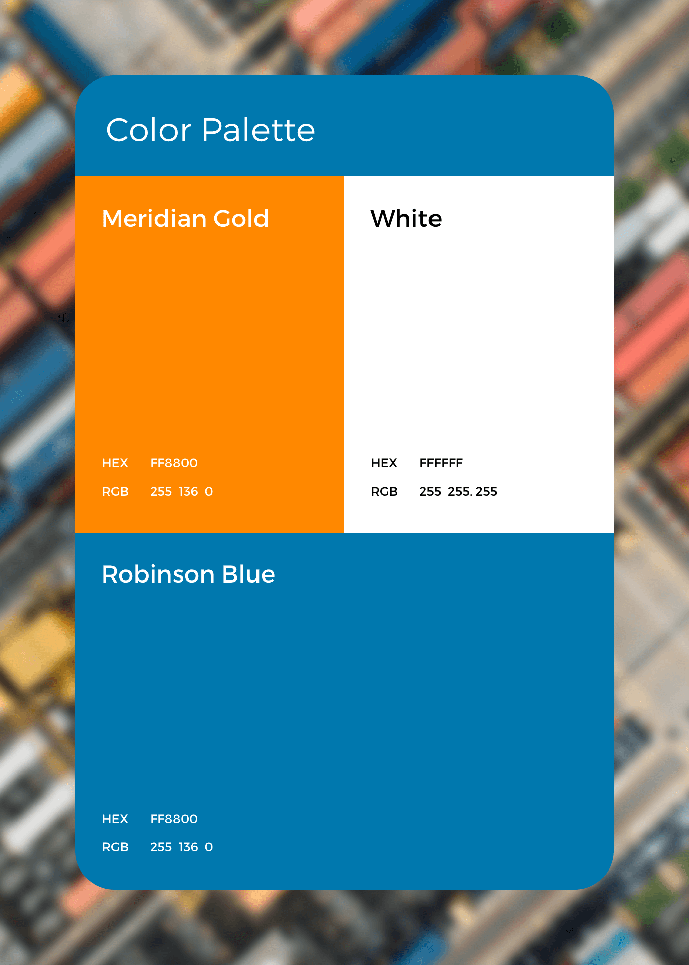
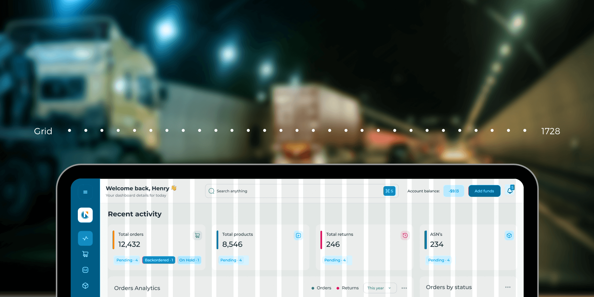
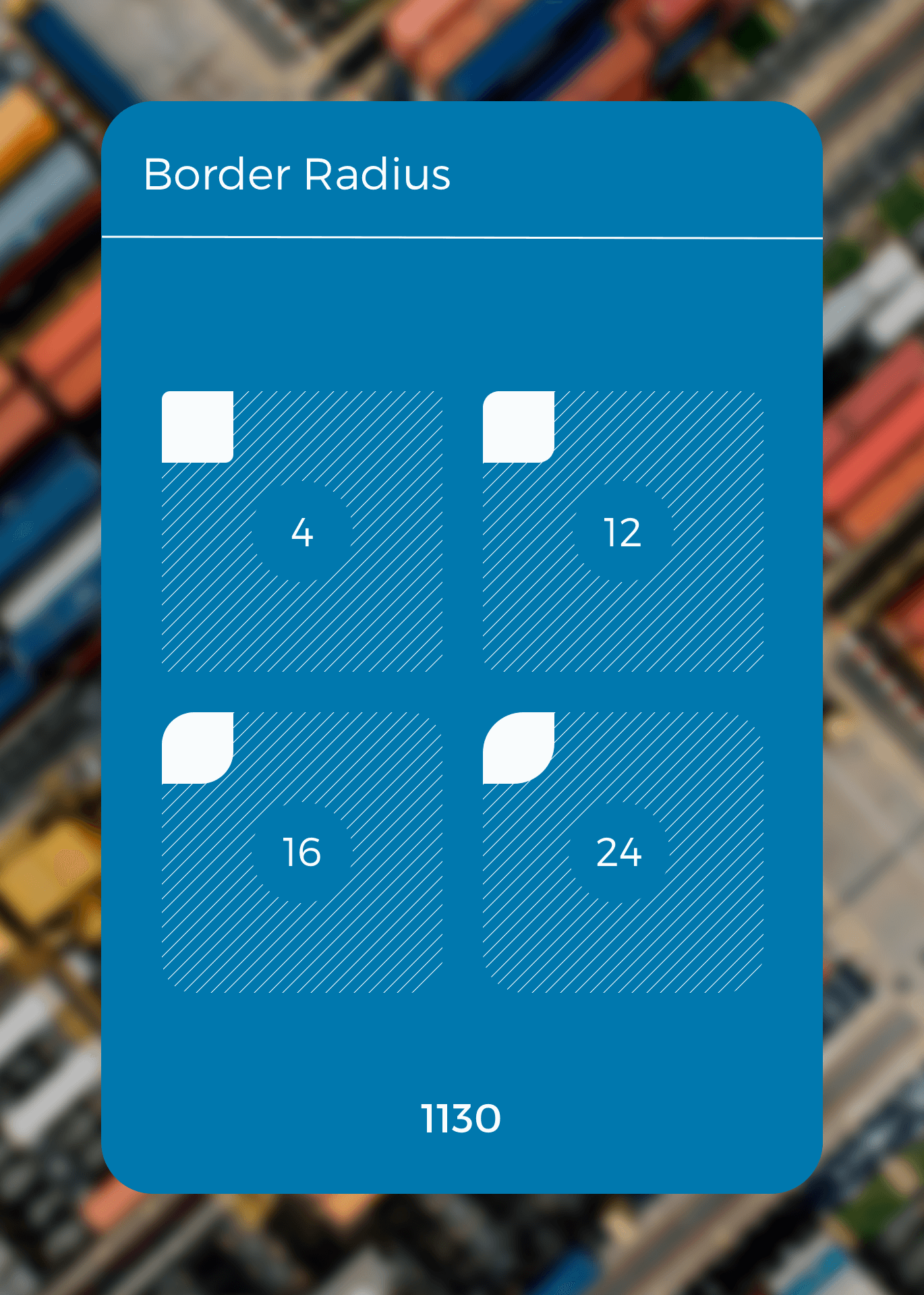
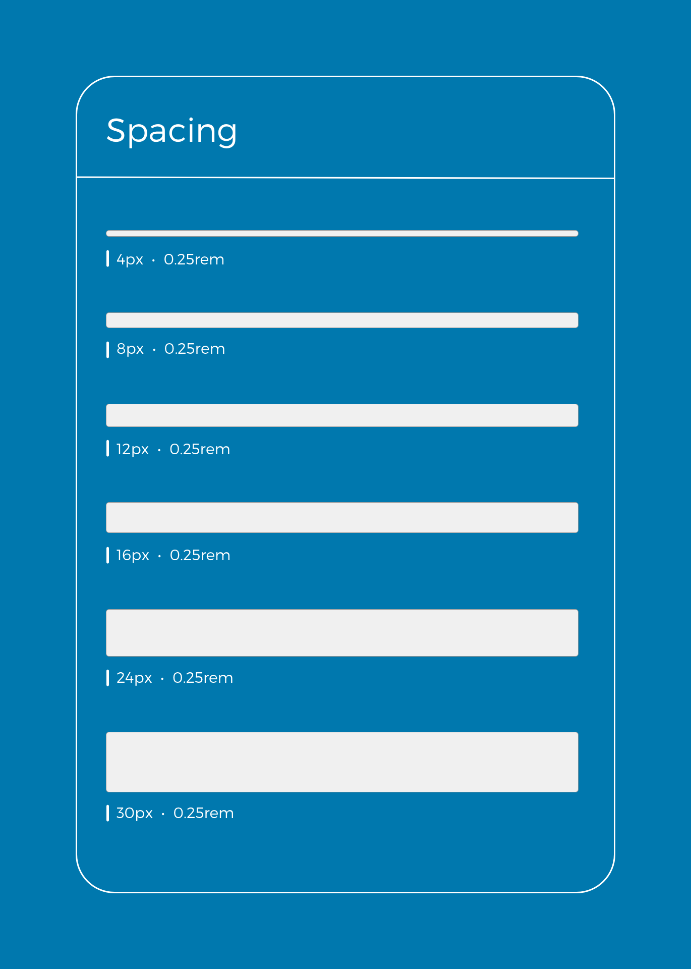
As the platform matured, we developed a modular design system to bring visual and functional consistency across interfaces. The system defined scalable UI components, typography rules, spacing grids, color palettes, and interaction patterns—ensuring that new features could be deployed quickly without compromising coherence. Designed for cross-platform performance, the system allowed product, design, and engineering teams to collaborate more efficiently while reducing redundant design decisions. It also supported accessibility and responsiveness, enabling Navisphere to adapt fluidly across devices and user contexts.
Before the redesign, I was bouncing between screens just to track a single load. Now I can see everything I need in one place—and fix problems before they hit the customer.”
— Tasha Martinez, Senior Logistics Manager, Weston Foods
Impact
Results That Moved Freight Forward
+90
Consistent usability score in post-launch stakeholder surveys
24%
Faster task completion for shipment tracking and updates
31%
Fewer clicks per session on high-frequency workflows
