Stanton Orchards Web Design Case Study
Overview
Conquering new online audience
Challenges
Local brand grows into a national favorite

Approach
From the beaten path to exciting buyer journey
Web Design
New boosted online engine
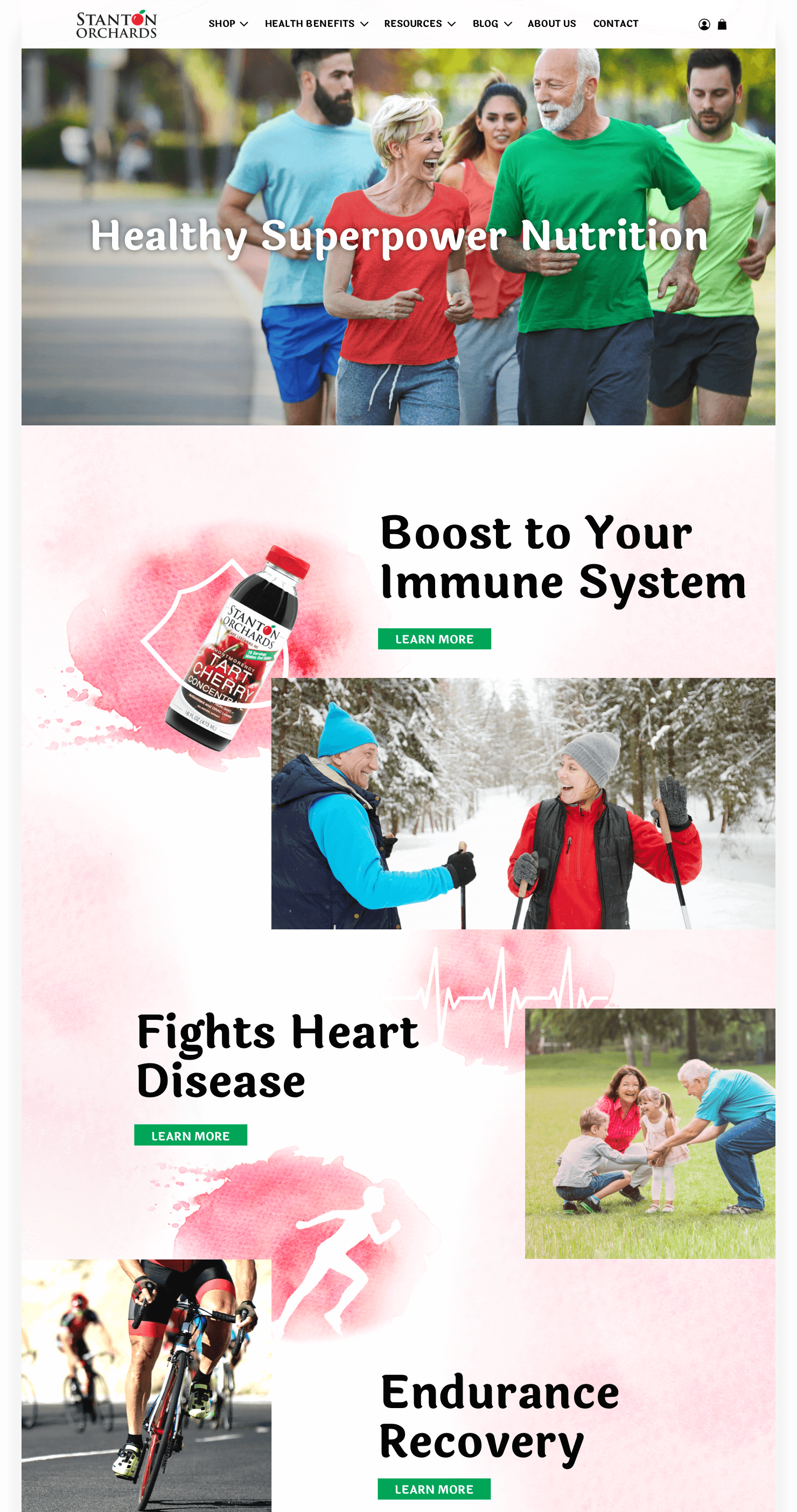
As a first step we migrated the site to the new Shopify platform. It decreased the pages load time, improved checkout experience and reduced abandoned cart products. Further on we reconfigured the main page, made stronger product pages by adding enhanced brand content (EBC) to help communicate benefits.
The other objective we kept in mind was expanding the audience. We stratified it and determined major categories of customers. This data allowed us to create dedicated pages highlighting tart cherry concentrate features that important for a particular group of customers.
Considering that visitors seek an empathetic approach, we bid on providing comprehensive answers instead of serving them with ads.


Web Design
Brand awareness through family story told

Product Imagery
Professional imagery gives an edge over the competition
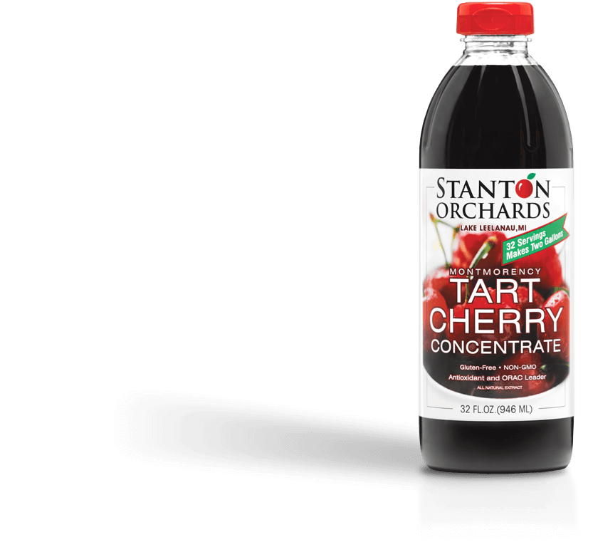
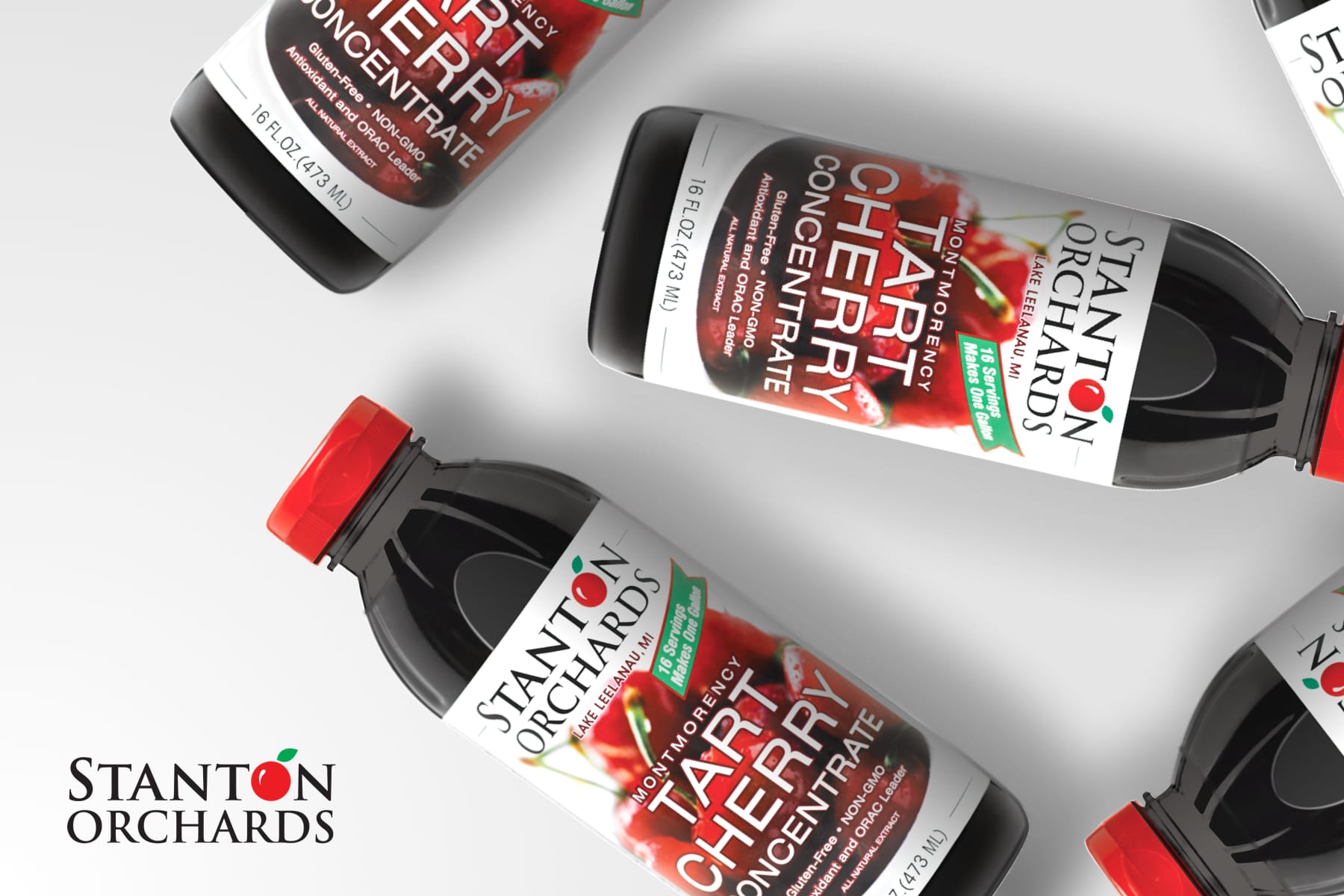
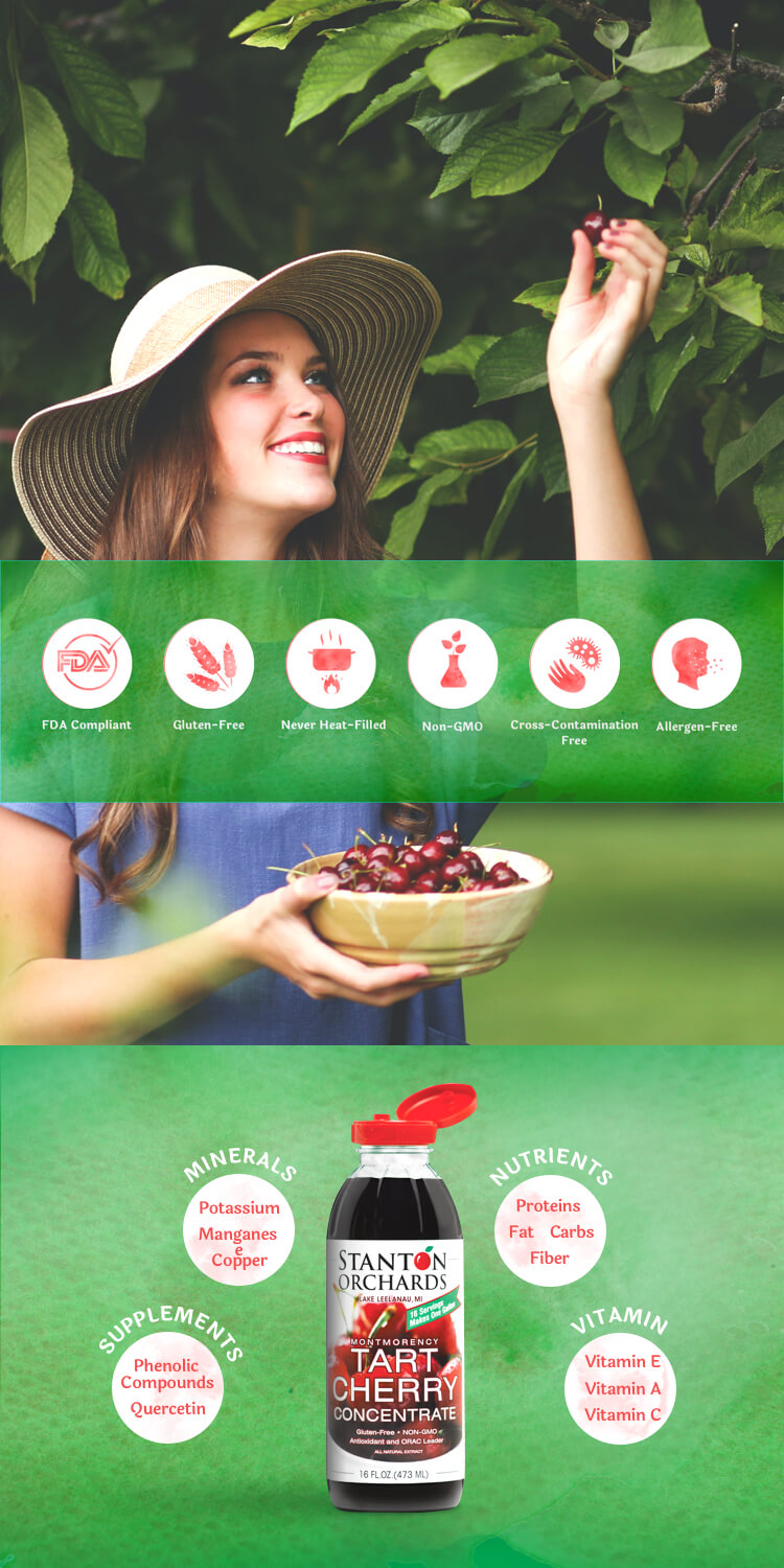
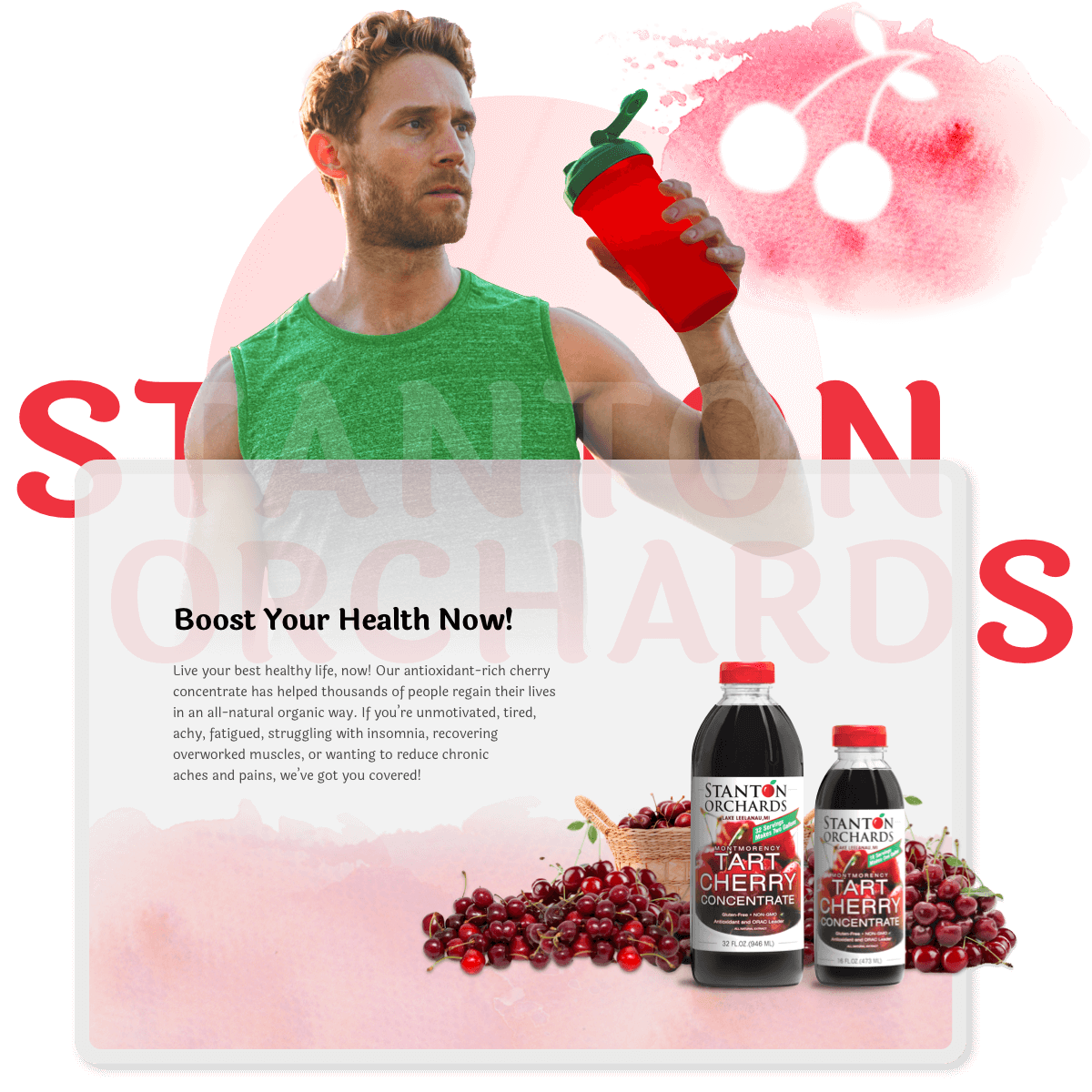
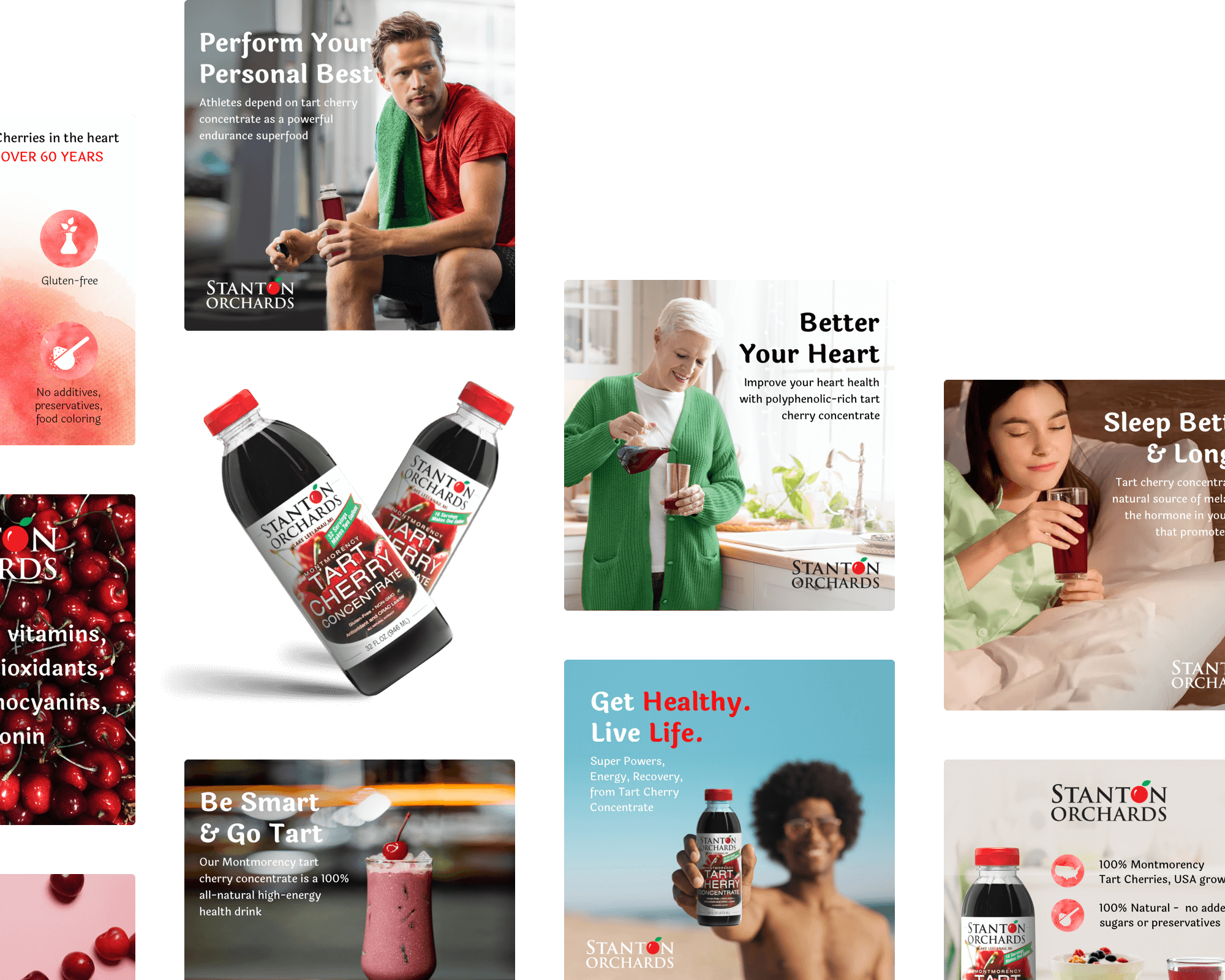
We considered product images as the core aspects of Stanton Orchards e-commerce campaign. In addition to the mandatory main images we developed sets of lifestyle photography and informational graphics. They’ve been tested on a Shopify platform and further on implemented on Amazon marketplace. Our custom tailored approach to visual styles of imagery allowed us to authentically connect with targeted groups of audience on every step of the sales journey.
Enhanced Brand Content
Engaging visual content for stunning product
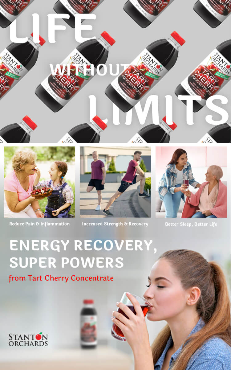
Having Shopify website live and products launched on Amazon we focused on strengthening positions of Stanton Orchards tart cherry concentrates on both e-commerce platforms. The best practice included Enhanced Brand Content implementation. We showcased the unique value proposition of products through advanced images and text placements. EBC allowed us to provide a branded shopping experience and as a result to boost conversion, increase traffic and sales.
Marketing
Optimized Amazon storefront that sells

The final step in establishing a cohesive e‑commerce campaign was the Stanton Orchards Amazon storefront. This branded site within Amazon marketplace allowed us to showcase all products in a single location. Larger blocks with lifestyle photography were intended to help customers envision themselves enjoying the company’s products. Smaller grids were ideal for messaging product features addressed to different groups of customers in a compact space. As a collateral marketing material we designed a printed insert that was placed in packages and promoted the subscription program.
