Borst Automotive Web Design Case Study
Summary
How Borst Automotive doubled number of locations…
Borst Automotive is a autocare shop that provides expert repair and maintenance services to customers in Arizona. Company has been serving over 50 years since 1968. Borst approached us at a pivotal stage of their development. Owner’s strategy included statewide expansion with opening new stores in other cities in Arizona and doubling the number of locations.
Challenges
When challenges transform company for good
Borst had a number of impediments on the way to its goals. Firstly we had to reorganize a fragmented brand system to raise brand awareness. It should help to find the right niche, avoid Borst to compete with everyone on the market and reduce cost of clients acquisition in new locations. Next we wanted to help Borst overcome the problem of an aged customer audience and shift it towards younger clientele. This is why creation of a new website as a main digital marketing hub based on solid design principles was paramount.

Approach
With only weeks to develop the system
Borst Automotive is a autocare shop that provides expert repair and maintenance services to customers in Arizona. Company has been serving over 50 years since 1968. Borst approached us at a pivotal stage of their development. Owner’s strategy included statewide expansion with opening new stores in other cities in Arizona and doubling the number of locations.
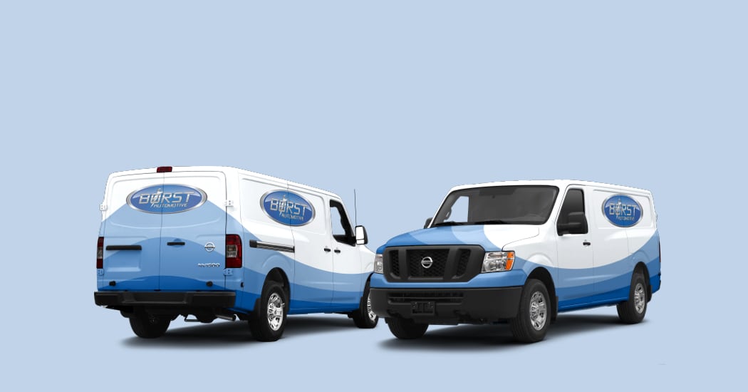
Branding
Filling the gaps in the brand system
The first step was filling the gaps in the brand system. Our design concept was built around multilayering and was reflecting the idea of transition between ages that was aligned with the goal of reshaping customer demographics.
This concept was supported in the new color scheme by using one primary color with different tones. The palette was accented with dark blue that made the design system versatile in the sense of creating depth and strengthening the contrast.
Readability was the key aspect in choosing a font. Roboto typeface was an optimal choice thanks to its modern look and good readability across different devices. It also stays legible on a dark background. The idea of multilayering in typography was implemented by using accent script font to make design memorable and placing large subtle text behind main headers.


Web Design
Website development
During exploration we determined three emotional requirements to the site. It should convey a feel of expertise, have local charm and should not look salesy. On the creative step we found elements that provided individuality to the site. The first was a multilayered curved transitions between sections. It supported the initial design concept and established connection with the key brand element—Borst logotype.
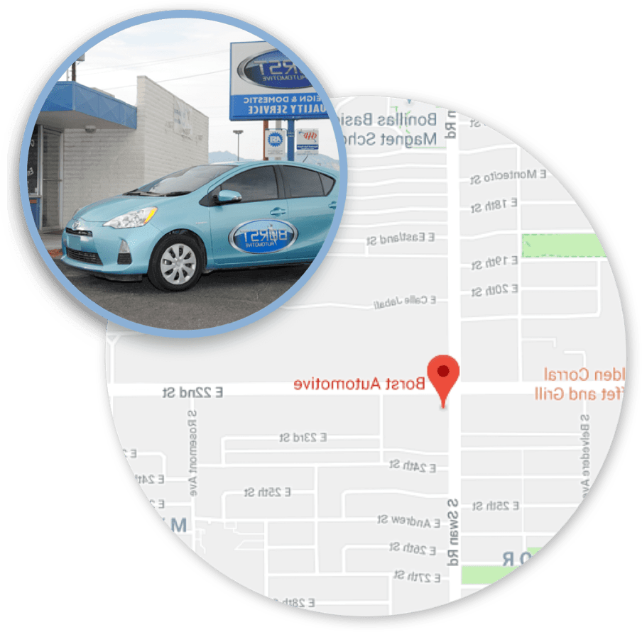
The next critical aspect of visual representation was using real photos that greatly helped in achieving desirable local look and expert feel. The final one was the enhancement of the site functionality. Updated site structure made navigation convenient and left room for evolution. During the maintenance phase Borst asked to add new pages that we effortlessly did without disrupting the structure.
Growth-driven design approach allowed us to deliver a minimal viable product within 3 weeks and start testing marketing strategy right away.


Marketing
Complex approach to complex goals
In order to reach client goals we offered a marketing campaign that included two components: tracking visitors and raising brand credibility. We drastically redesigned email forms making them appealing and straightforward. Borst was recommended to step away from practice of offering fussy deals on a homepage. Instead we created a dedicated page for offers and focused on thought leadership and customer education.
We developed a landing page informing them about Voluntary Vehicle Repair Program provided by state of Arizona. Additionally we designed downloadable brochure that involved new customers in a funnel. This campaign helped to portray Borst as a caring auto shop. Brand credibility was additionally consolidated by integrating and displaying Google reviews on the site to let visitors seamlessly read them.


The critical aspect of visual representation was using real photos. It greatly helped in achieving desirable local feel and introducing Borst as a credible expert.
Solution #3
Credibility and Reviews
Next step in brand credibility consolidation was to raise awareness among new audience about Borst high quality of service. As a solution we developed a live integration of Google reviews on the site to let visitors seamlessly read them.
Results
How Borst Automotive doubled number of locations…

How Borst Automotive doubled number of locations…
– Bryan Borst

Approach
When issues transform into challenges changing company for good
Our refined strategy included three interrelated solutions: brand enhancement, website redesign with trackable metrics and focus on inbound marketing
Our refined strategy included three interrelated solutions: brand enhancement, website redesign with trackable metrics and focus on inbound marketing
Design
Brand awareness
The first step in design was filling the gaps in the brand system. Our design concept was built around multilayering and reflected the idea of transition between ages that was aligned with the goal of reshaping customer demographics.
This concept was supported in the new color scheme by using one primary color with different tones. The palette was accented with dark blue that made the design system versatile in the sense of creating depth and strengthening the contrast.
Readability was the key aspect in choosing a font. Roboto typeface was an optimal option thanks to its modern look and good readability across different screens and devices. It also stays legible on a dark background. Additionally the idea of multilayering in typography was implemented by using accent script font to make design memorable and placing large subtle text behind main headers.
